Best Practices for Designing Selection Controls
Explore the best practices for designing helpful and functional selection controls
Selection controls — checkboxes, radio buttons, and switches — allow users to, well, make selections. Each has a time and place, depending on the exact functionality of the selection.
Understanding how best to use each selection control allows you to design interfaces that function as a user expects. Following best practices can make it easier for users to complete forms and even to choose the options you’d prefer them to choose.
Uniformity in the size of
Although one goal of UX design is to guide user actions, it's essential to do this transparently and ethically. Steering behavior should never involve trickery but should aim to help users make informed and easy choices.
Aligning your subheads with the actual
When aligning
When it comes to designing interfaces, text readability next to
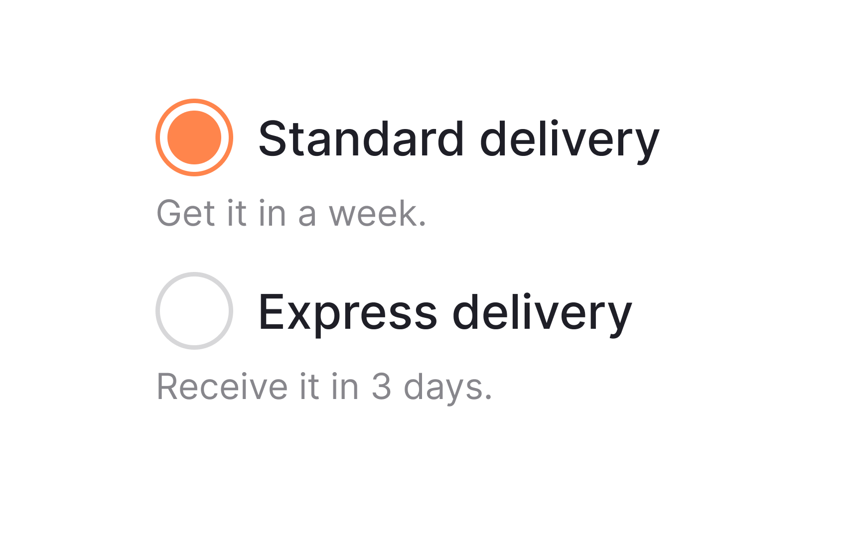
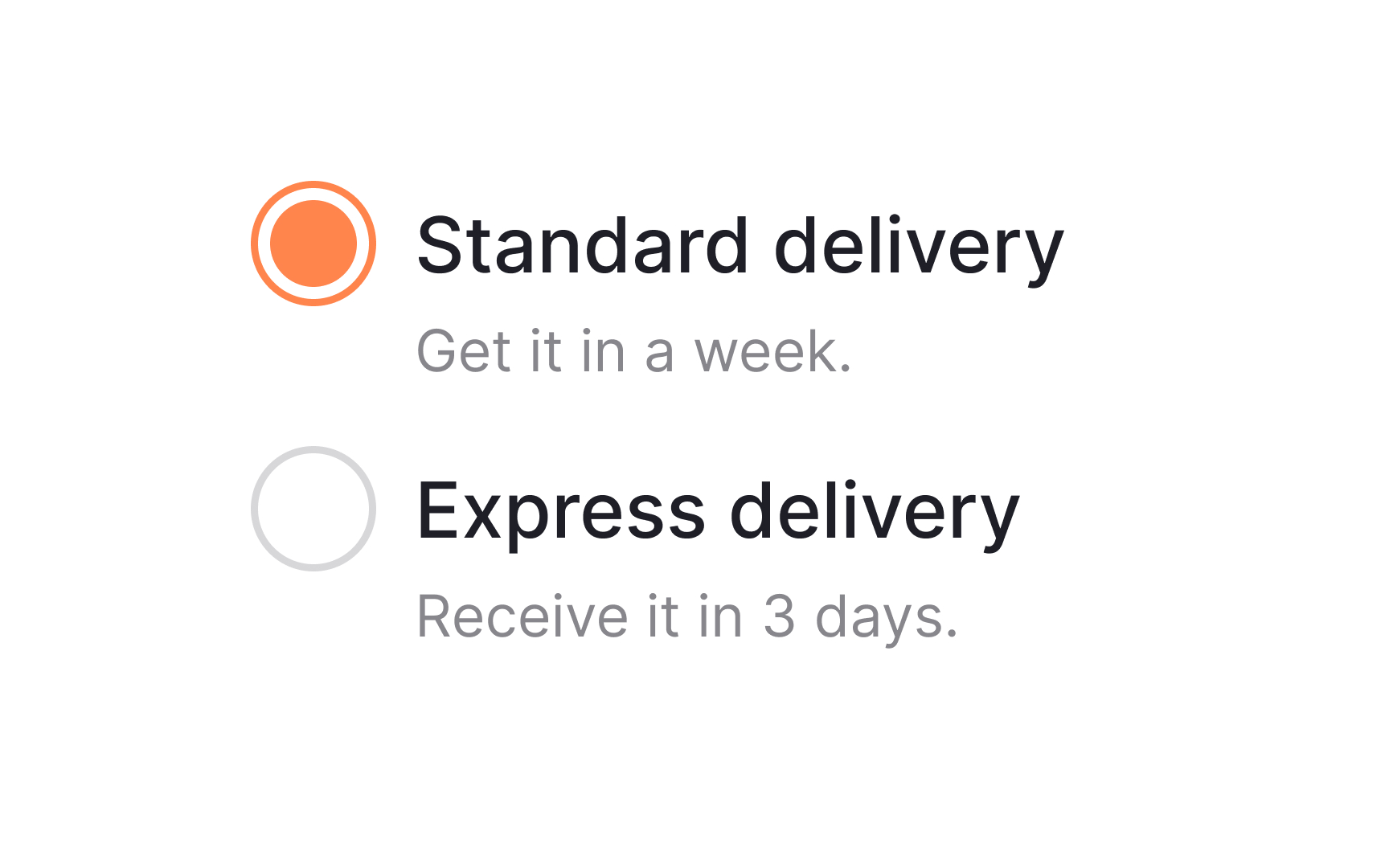
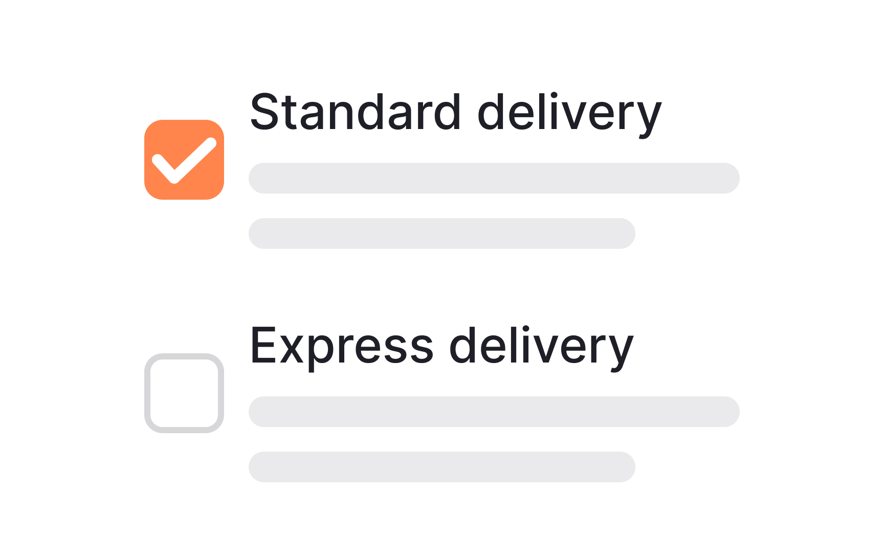
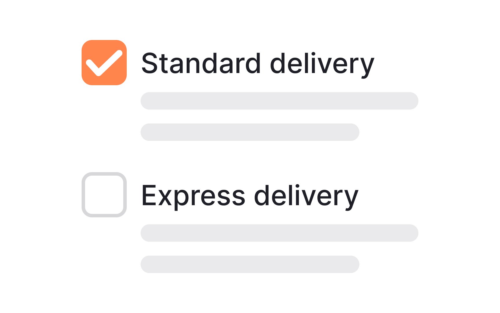
One crucial tip is to maintain consistent alignment for wrapped text. If your text spans multiple lines, each line should align with the one above. This approach not only boosts legibility but also ensures that key information won't be missed. Plus, it draws the right kind of attention to the selection controls themselves, making them more noticeable.
Sticking to familiar UI patterns is crucial when designing
The idea isn't to stifle creativity but to maintain a balance between innovation and
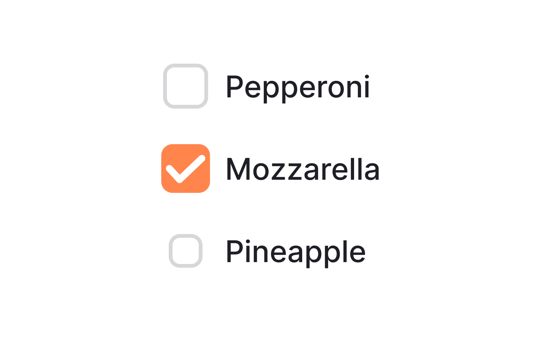
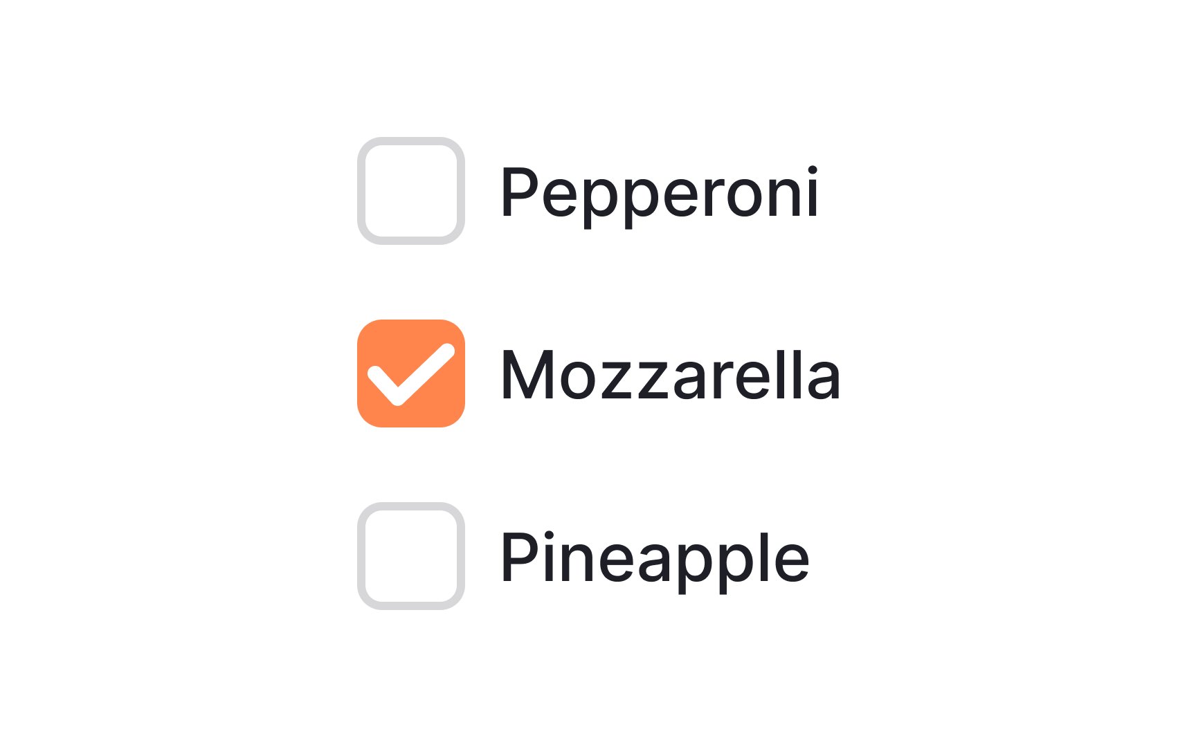
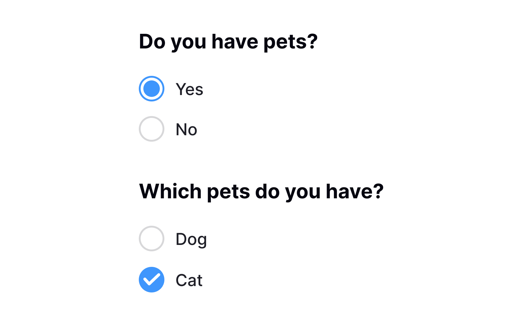
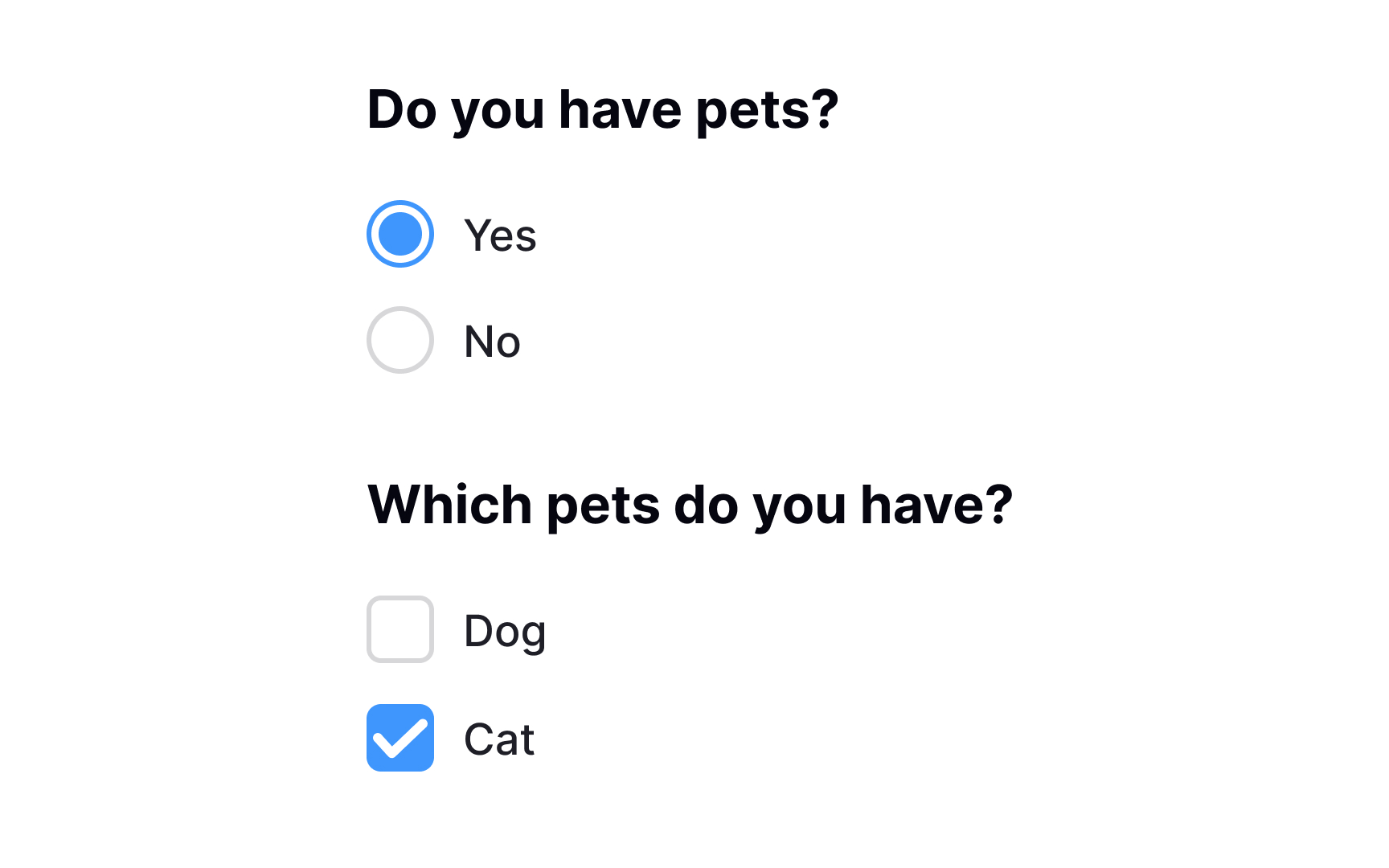
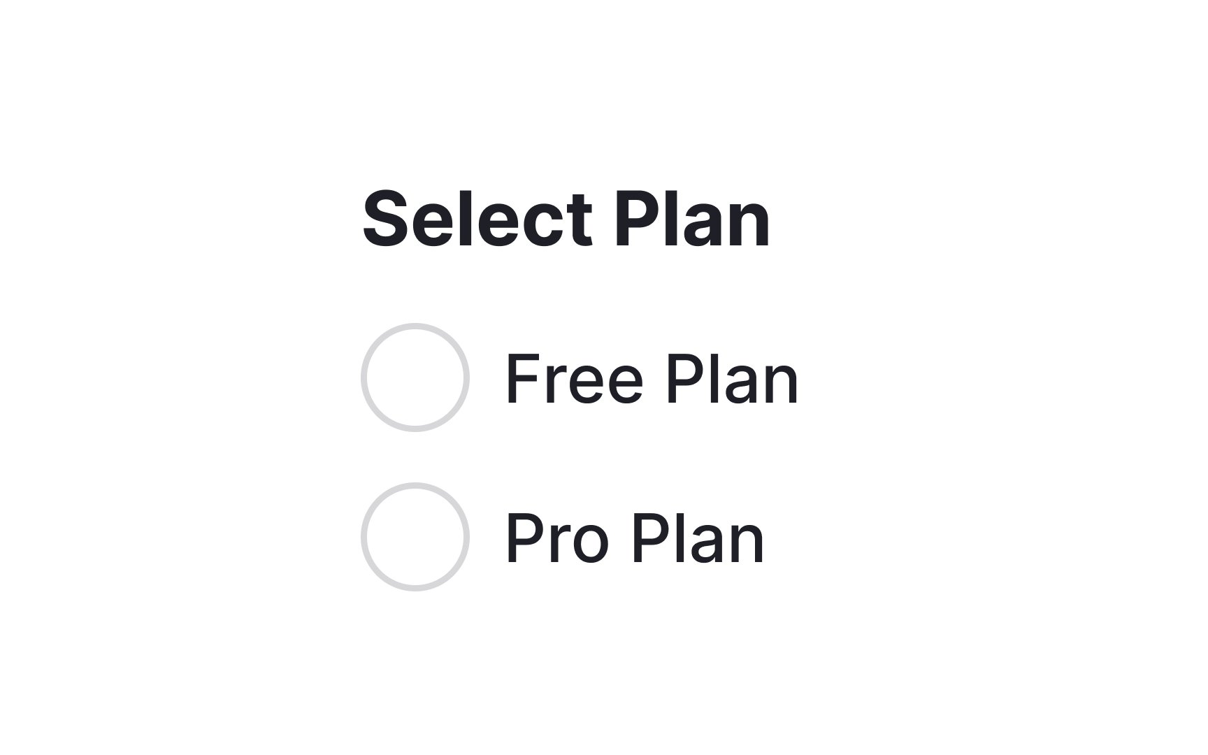
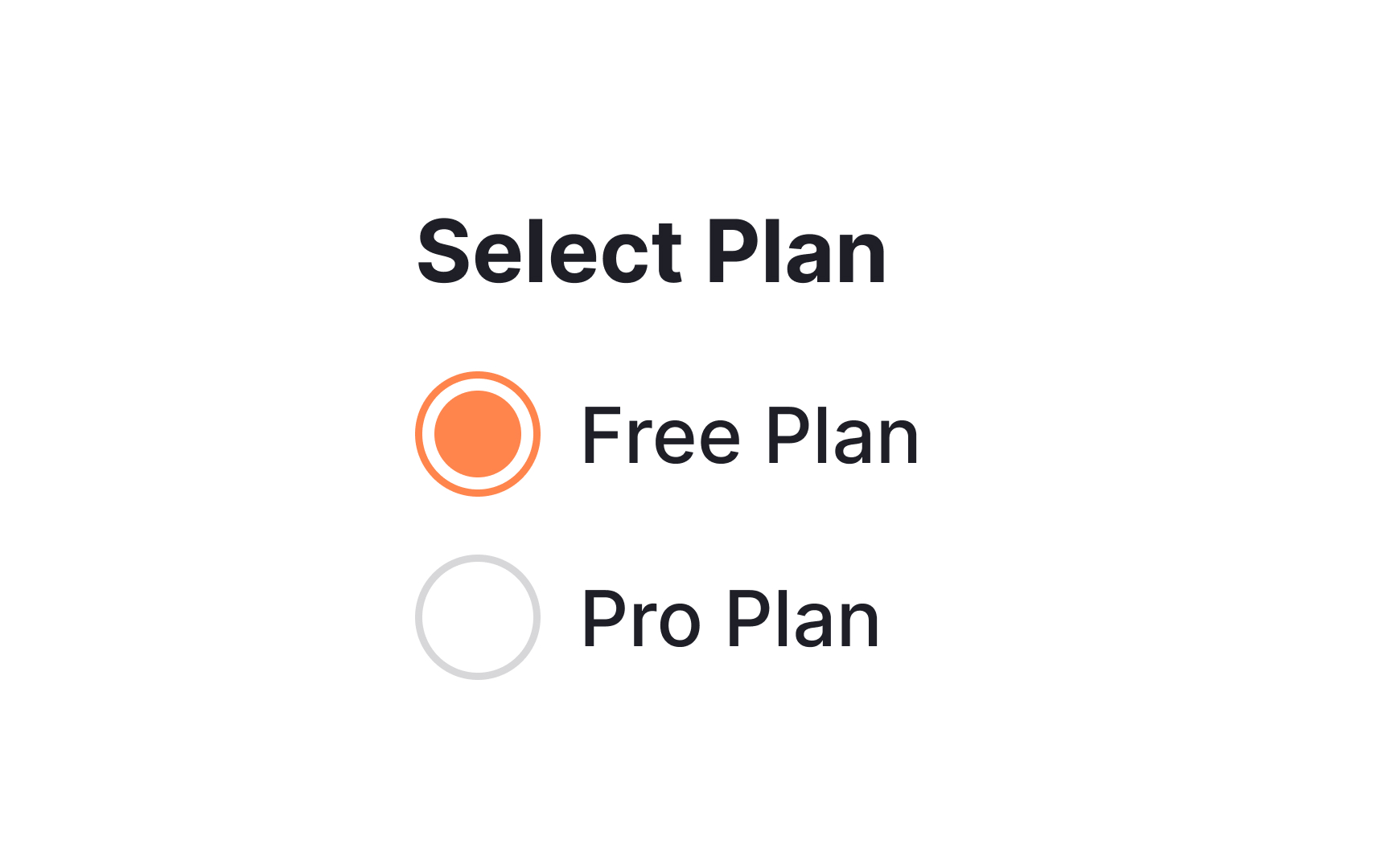
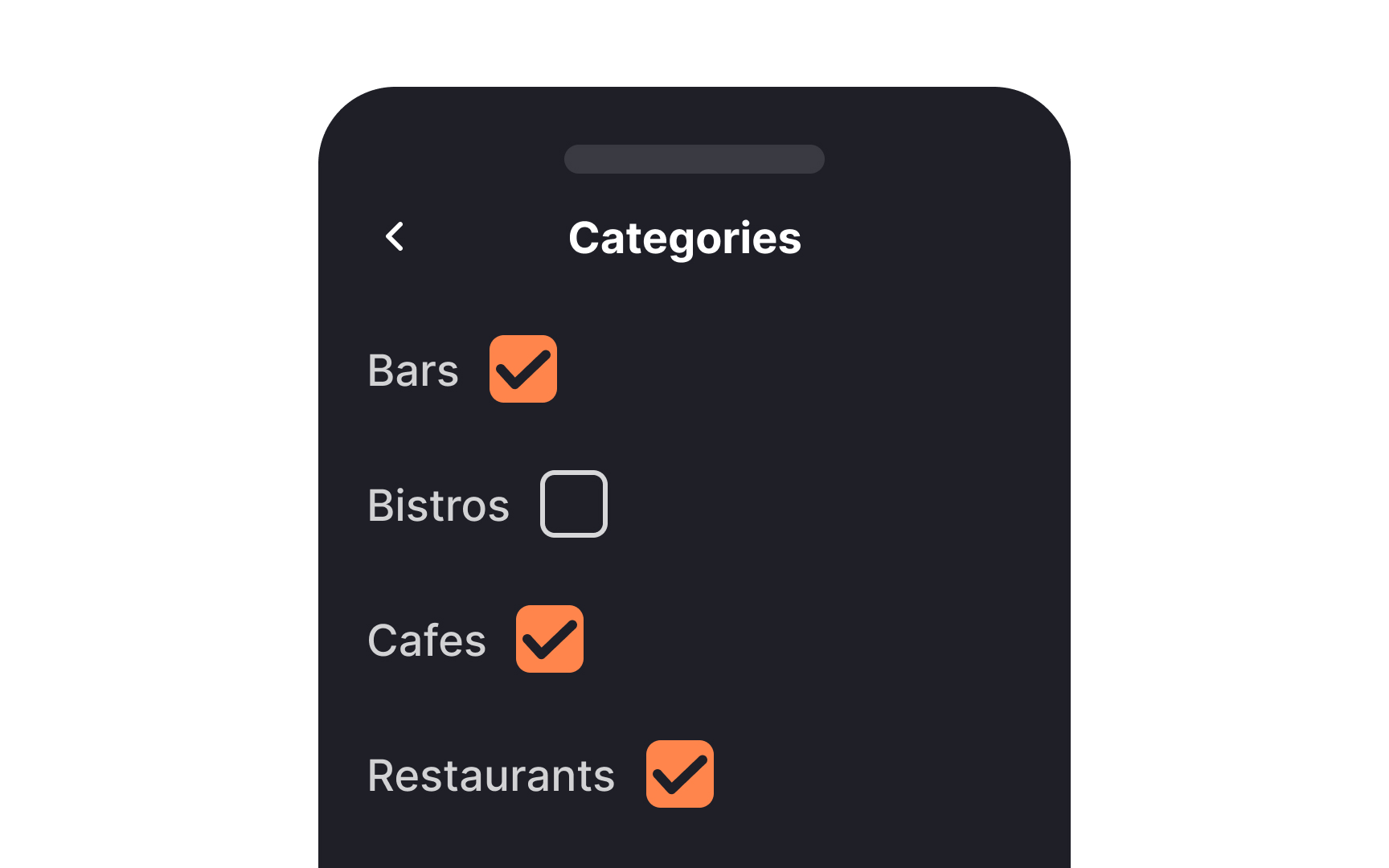
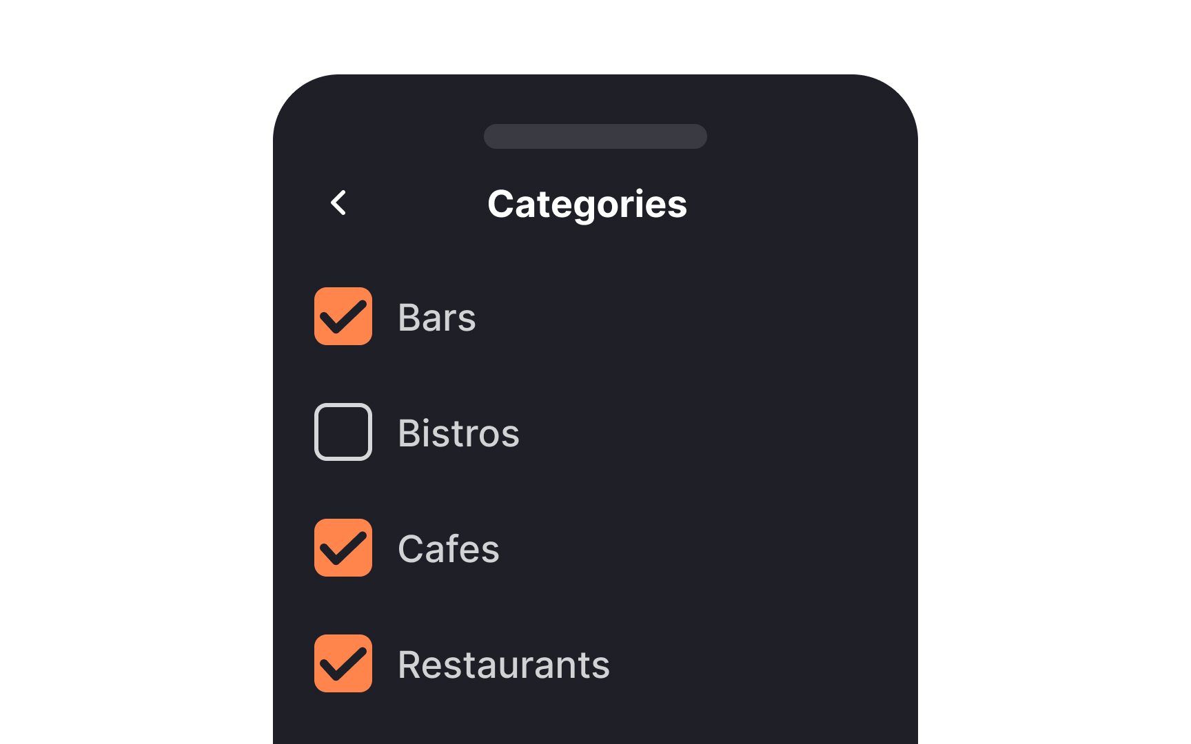
When a list contains multiple related options,
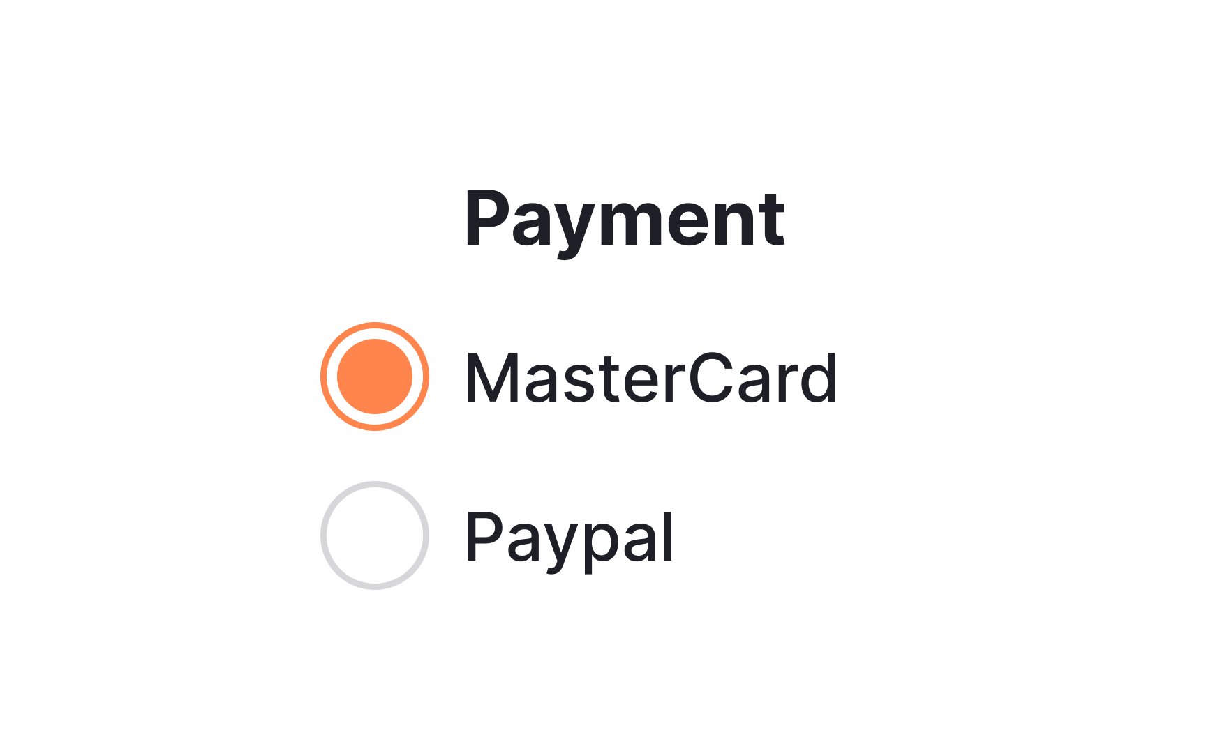
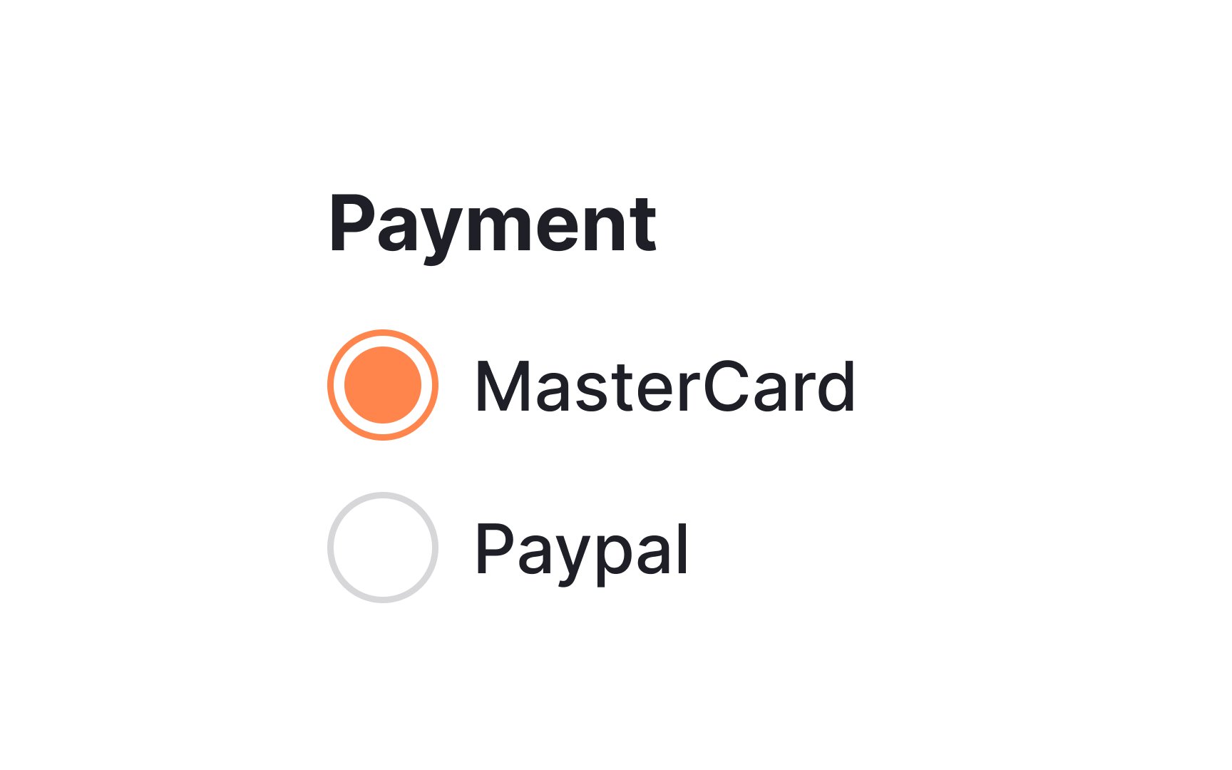
When dealing with
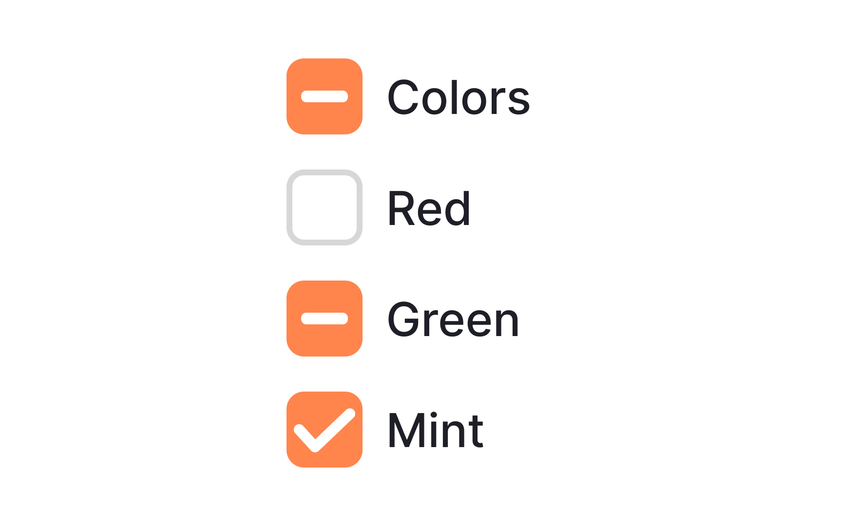
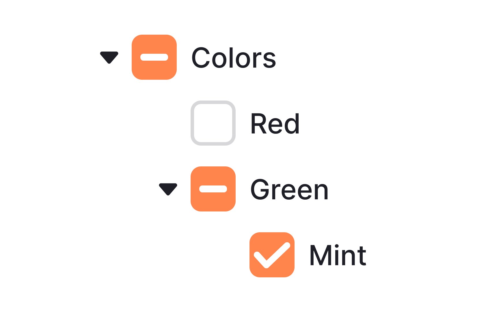
Nested options are essentially sub-options that fall under a main selection. Think of them as branches growing from a main tree trunk. In
This is a tidy and intuitive way to offer users more control without overwhelming them with choices upfront. By using checkboxes for nested options, designers allow users to select multiple sub-options while still keeping the interface streamlined and user-friendly.
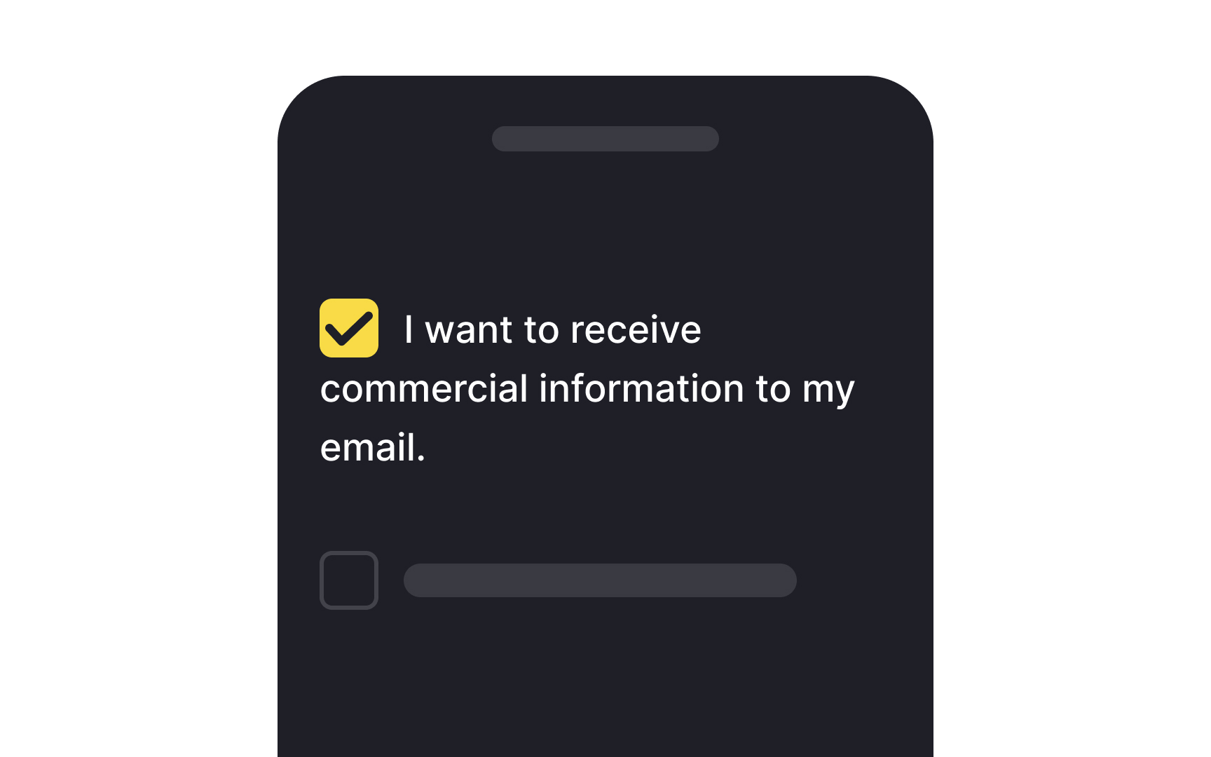
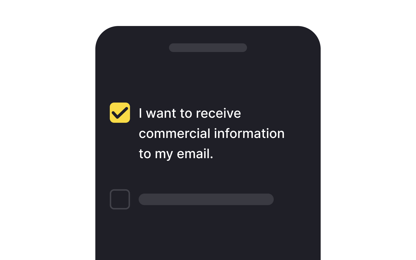
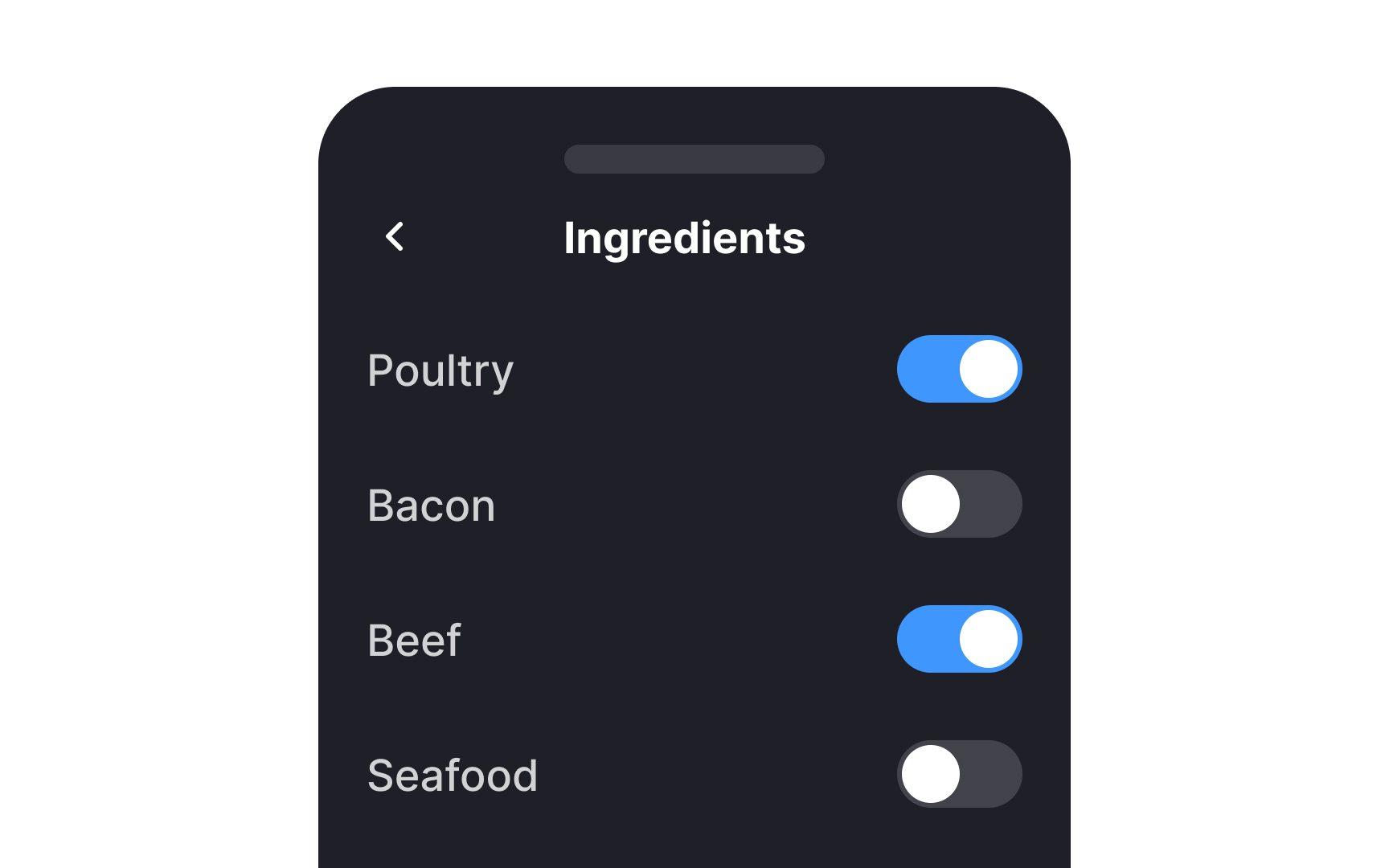
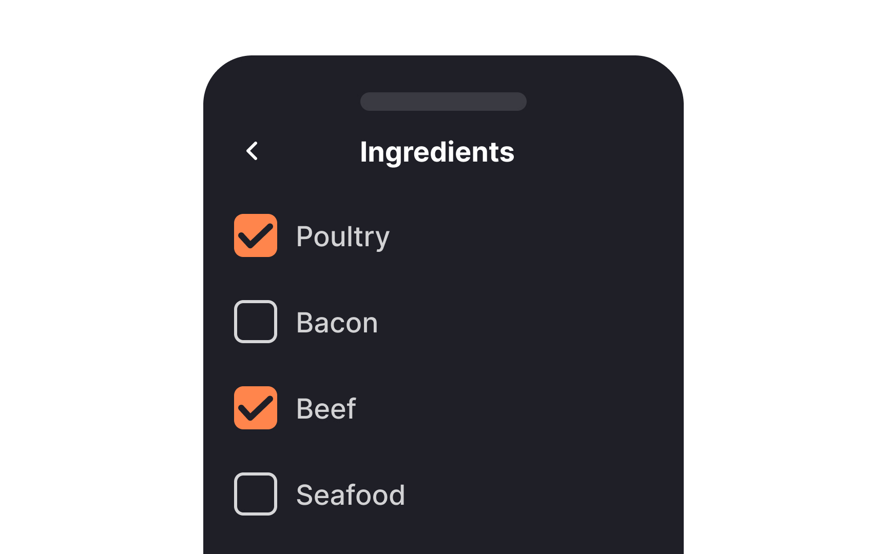
In left-to-right languages, controls like
Positioning controls this way also expedites user interaction, as it allows users to click through multiple controls in quick succession with minimal mouse or finger movement. Adhering to this pattern makes the interface predictable, helping users complete tasks more efficiently.
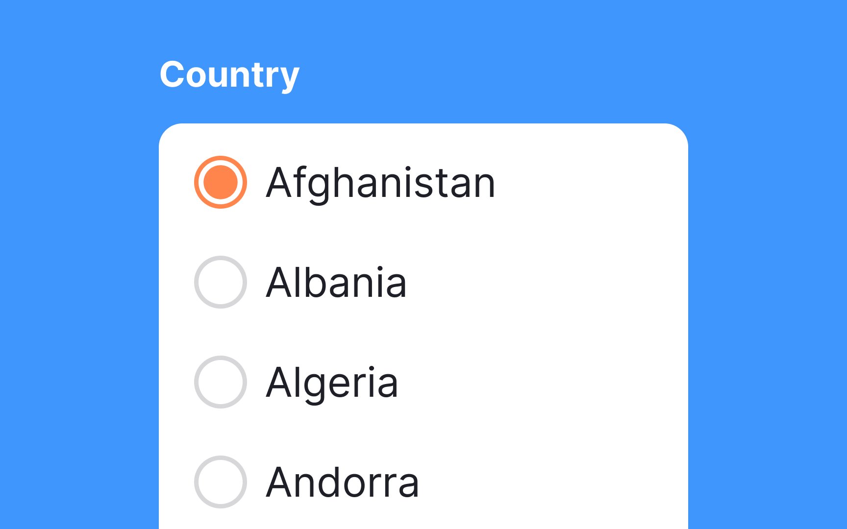
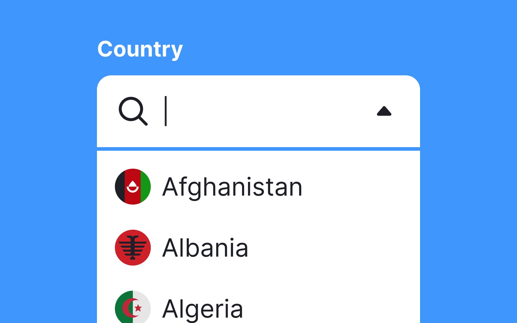
When dealing with extensive lists like countries, languages, or sports teams, it's essential to use the right
They not only conserve valuable screen space but also make the
Additionally, you can implement search into long dropdown lists so users won't need to scroll as much. This choice minimizes cognitive load and speeds up decision-making, enhancing the overall user
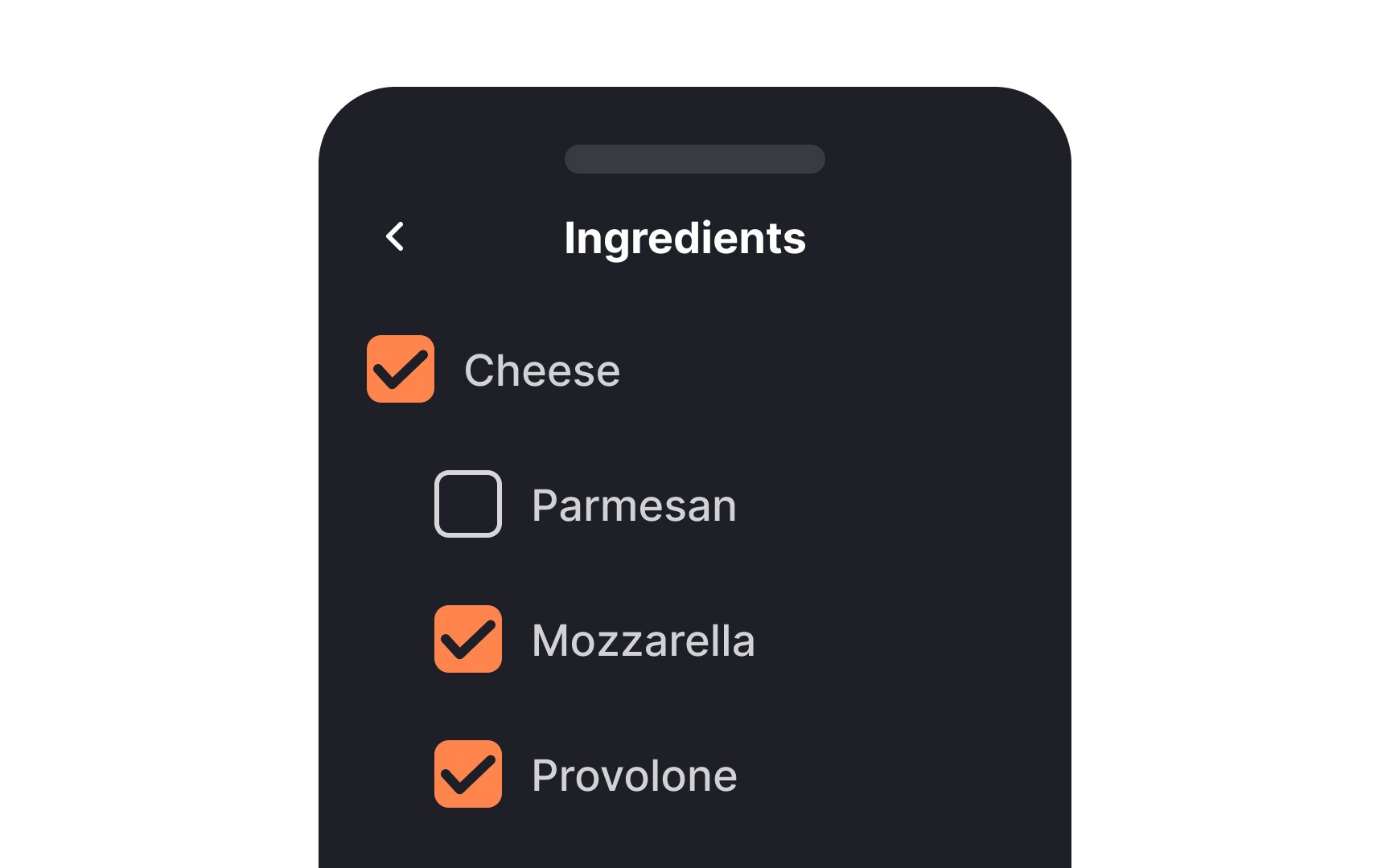

When you're dealing with multi-level lists using
If some are selected, you'll see a horizontal line, and a checkmark appears when all are selected. This indeterminate state offers clarity and avoids confusion, making it easier for users to understand the selections they've made or need to make.[3]
References
- Radio Buttons: Always Select One? | Nielsen Norman Group
- Indeterminate Checkboxes | CSS-Tricks | CSS-Tricks
Top contributors


Topics
From Course

Share


Similar lessons

Common UI Component Definitions I

Image Terminology
