Indicate an indeterminate state
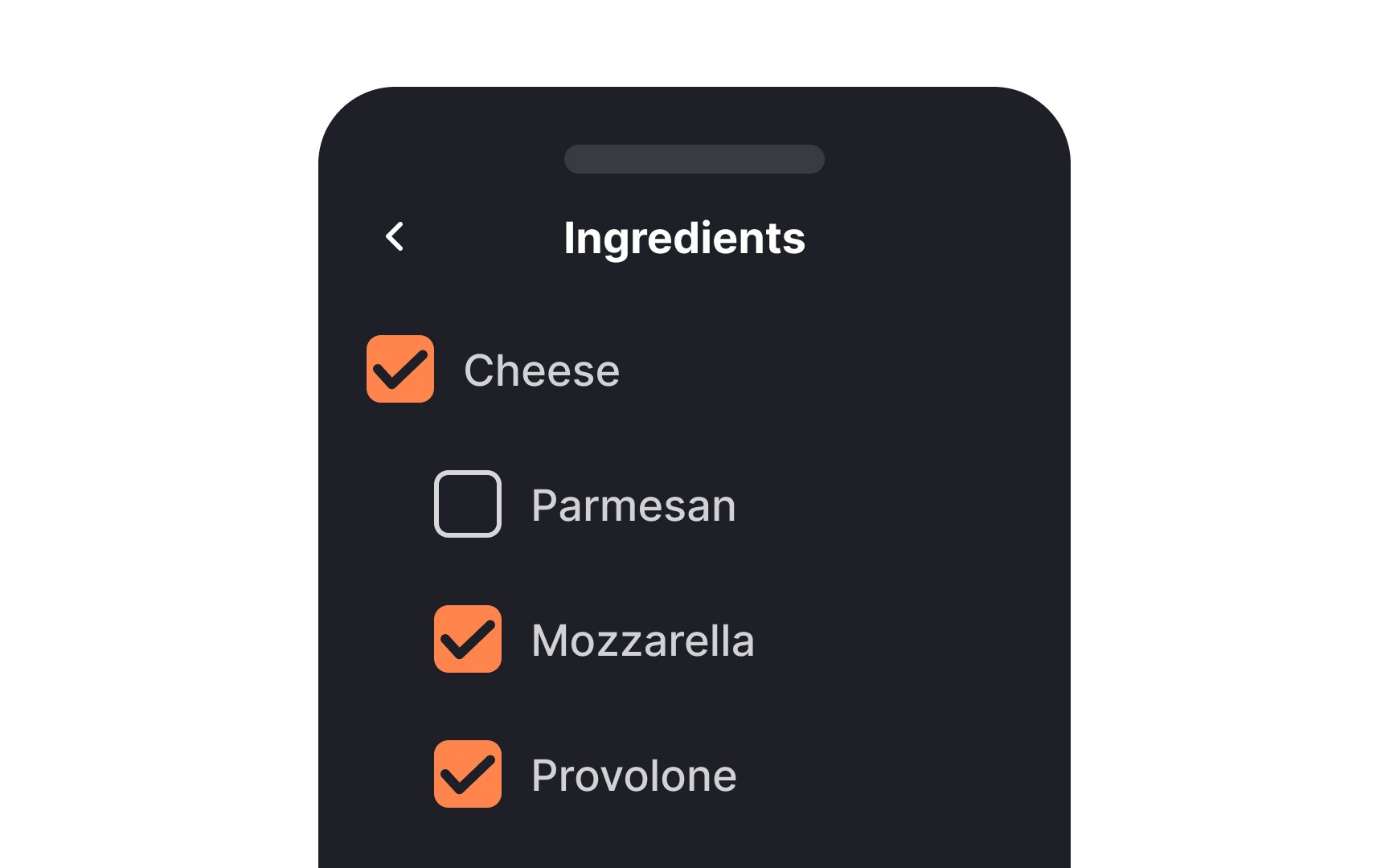

When you're dealing with multi-level lists using checkboxes, you're likely to encounter a variety of selection scenarios. This is where the indeterminate state comes into play. It visually communicates the status of subordinate options. When none are selected, you'll see an empty box.
If some are selected, you'll see a horizontal line, and a checkmark appears when all are selected. This indeterminate state offers clarity and avoids confusion, making it easier for users to understand the selections they've made or need to make.[1]
