Provide helpful error messages
When users fill up forms while making a purchase or booking a flight ticket, they want to stay informed about what's happening in the system.
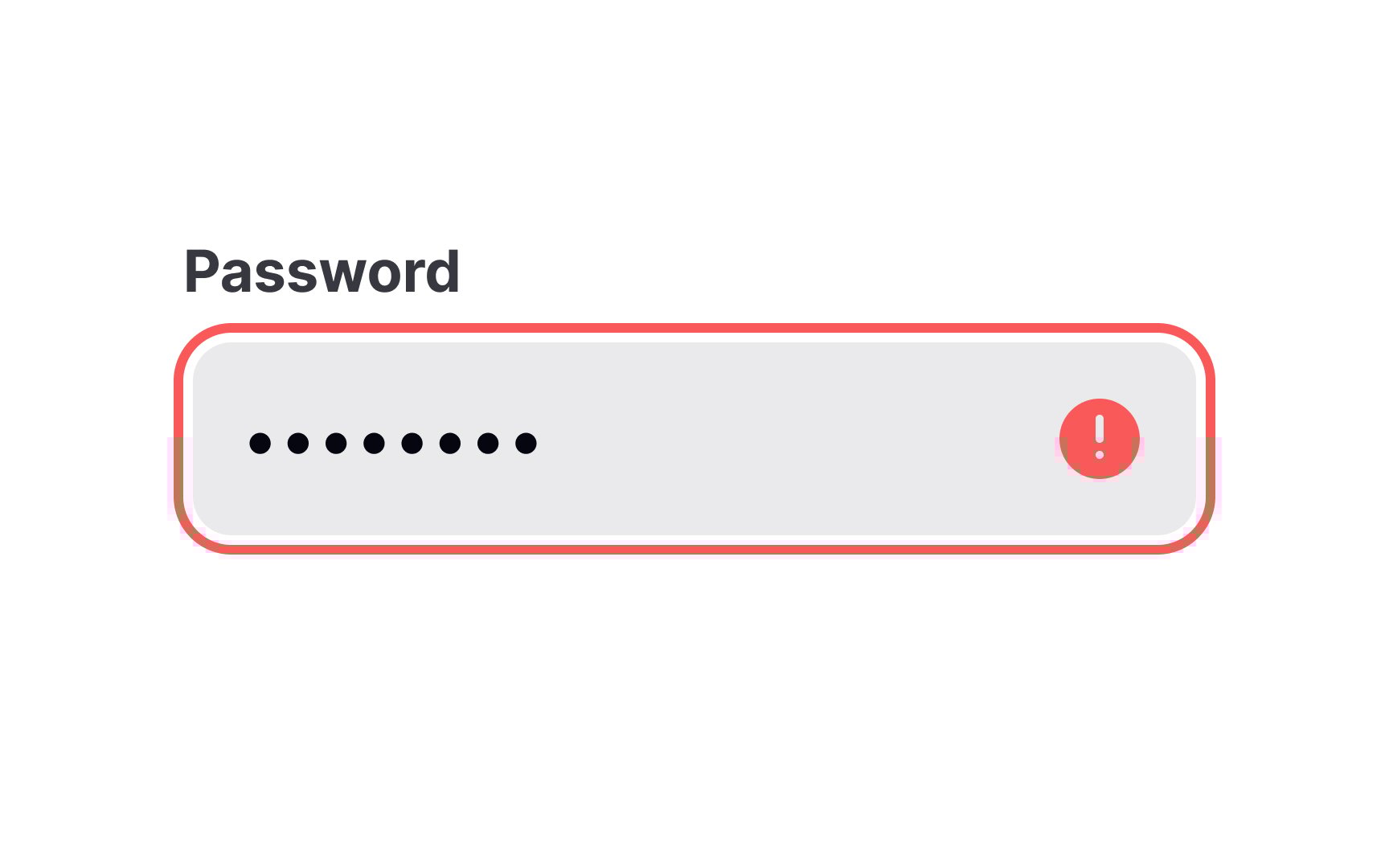
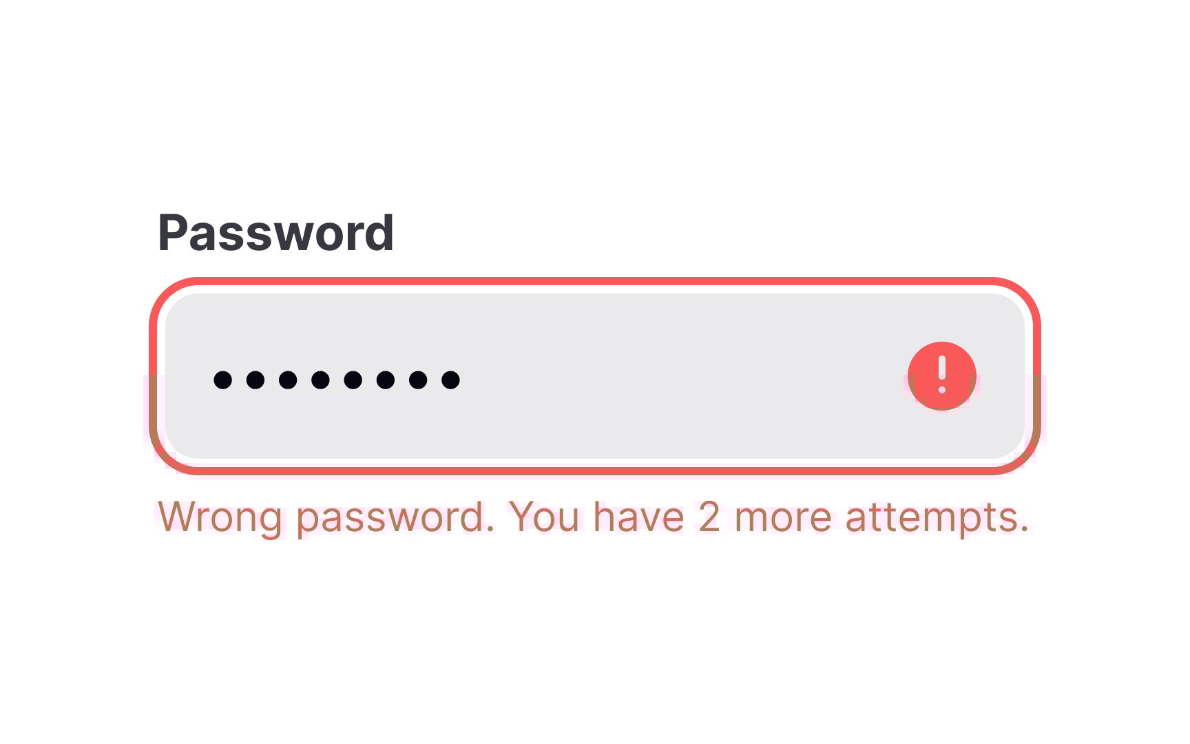
To make the error inputs easy to notice and understand:
- Indicate error inputs using a prominent, contrasting color (usually red) and a relevant icon.
- Politely describe what happened and what users should do to fix the problem.
- Apply real-time, inline validation rather than submit-time modals. The latter breaks the flow and distracts users. Errors that appear immediately allow users to correct their answers before moving on.[1]
References
- How to Report Errors in Forms: 10 Design Guidelines | Nielsen Norman Group
Top contributors