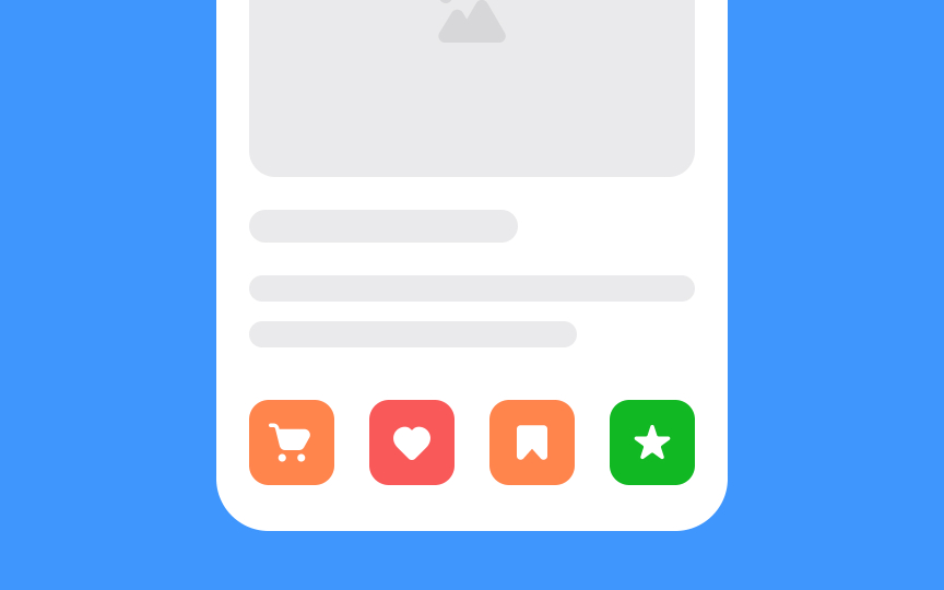
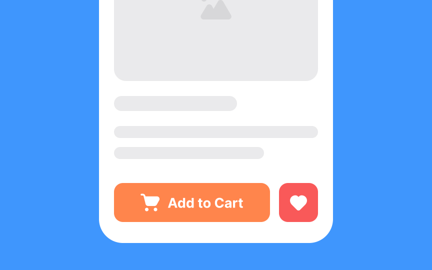
Icons should aid in user navigation
Deciding which icons to include starts with understanding user needs and common actions in your interface. Focus on streamlining tasks that users perform frequently or actions that need to be accessed quickly. Icons like an "add to cart" or "add to favorite" usually take priority for the product page, for example.
Always ask: Does this icon simplify the user's journey? If an icon doesn't add value or makes the experience more complex, it's likely better to omit it. Also, keep an eye on clutter. Too many icons can overwhelm users and dilute the effectiveness of the truly important ones.
Remember, the goal is to make your interface quicker and more intuitive for users to navigate.

