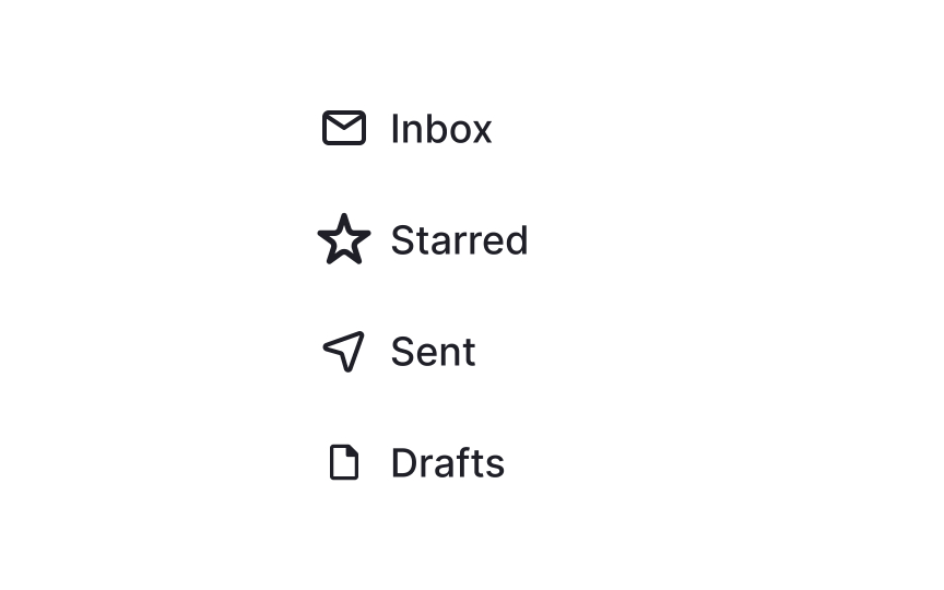
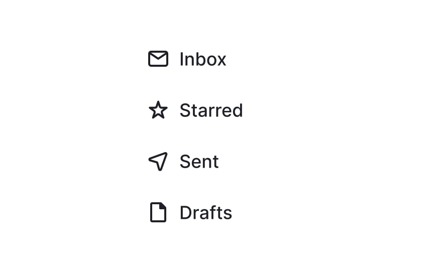
Balance out icons visually
When designing a set of icons, it's crucial to consider not just their actual dimensions but also their visual weight. Some icons, like a YouTube logo, may have complex designs or bold colors that make them appear more prominent, even when they occupy the same-sized container as simpler icons.
To create a balanced, user-friendly interface, you may need to adjust the scale of such icons within their containers. The goal is not strict dimensional consistency, but rather a harmonious visual rhythm that enhances usability. It's all about making the icons feel visually "equal" to users, even if they technically aren't.[1]

