Place the error message near the erroneous input
When it comes to placing error messages in a form, there are various options to choose from, such as left, right, above, or below the input, as well as on the top or bottom of the form. However, which placement is the most intuitive, results in the least cognitive load, and helps users identify errors faster?
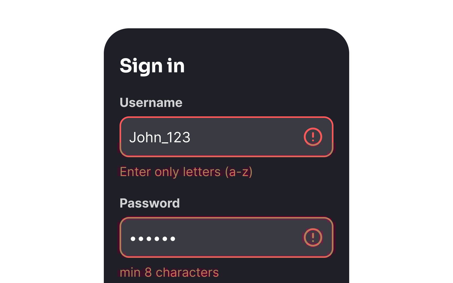
According to an online study involving 303 participants, the most preferred and expected placement for error messages is on the right side of the erroneous input. Although this placement takes up more horizontal space on the form, it is still the favored choice among users. The second most popular option is to place the error message below the input because it follows the natural reading order, helps users identify errors quickly, and takes up less space. This is especially important for mobile forms.
Surprisingly, placing error messages at the top or bottom of the form can result in a higher rate of consecutive errors because users may overlook them.[1]