Charts
Charts are an essential part of any dashboard, as they allow us to visualize and compare data. Common types of charts include bar charts, line charts, pie charts, and scatter plots. Choosing the right chart type isn't just a matter of taste. It depends on how many data categories you have and the chart's purpose. For example, pie charts aren't a good fit for comparing more than 5 slices. It gets too crowded and hard to read for users.
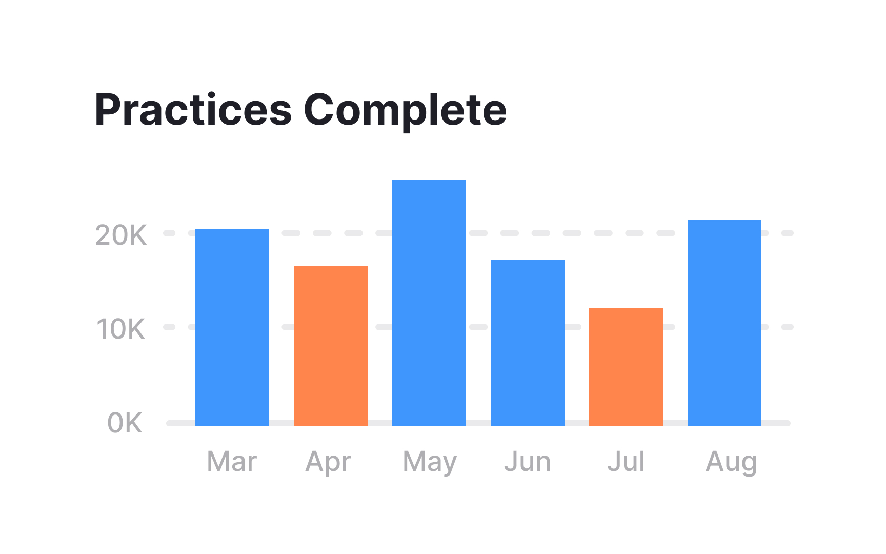
Charts often accompany textual content, offering a compelling way to present statistical information, comparisons, and distributions. Well-designed charts use clear labels, colors, and scales to enhance readability and accessibility. They are valuable tools for data-driven applications, dashboards, and reports, enhancing user engagement by transforming raw data into meaningful visual narratives.
