Make sure all critical menu options are fully visible
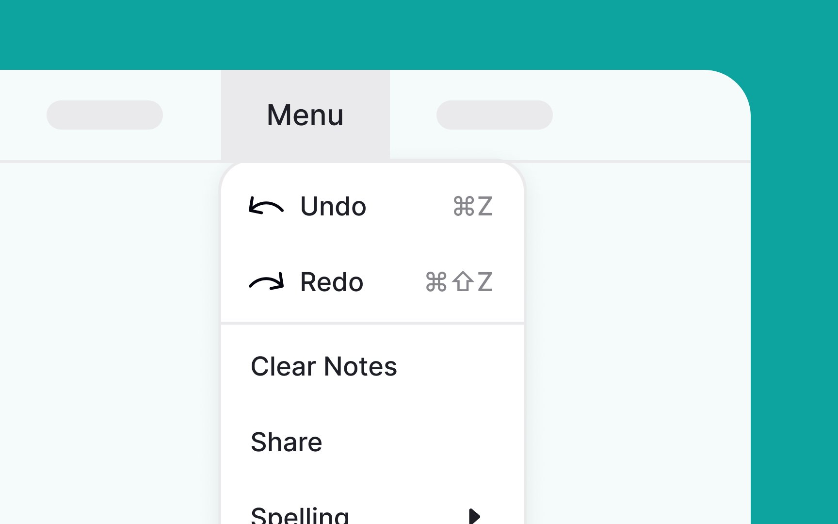
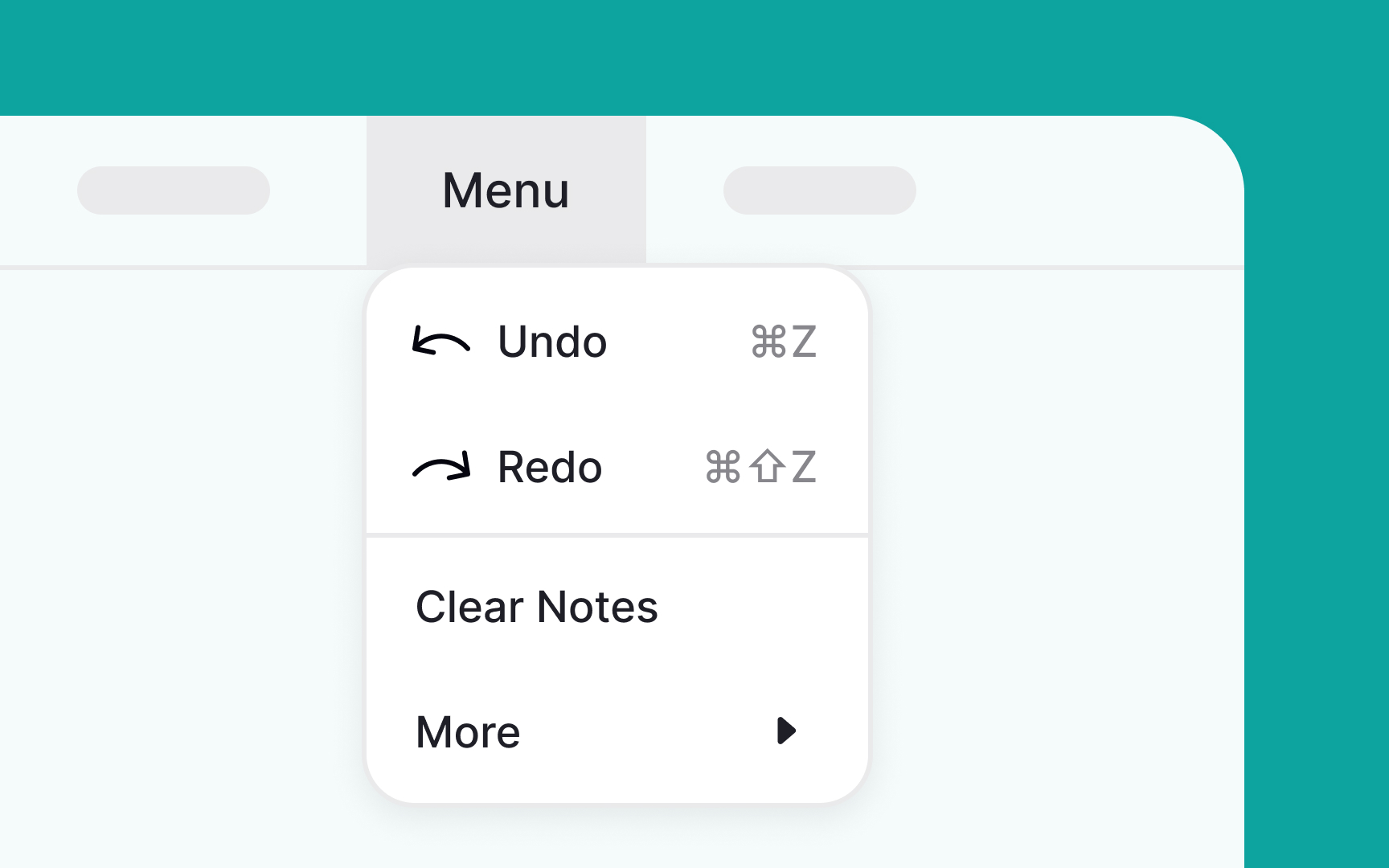
When you have enough screen space, there's no need to tuck away menu items or add extra levels. Doing so can make interactions more cumbersome, increase cognitive load, and slow down users in finding what they need.
Keep it simple and straightforward: place the most frequently used options at the top of the menu. This way, users can quickly find what they're looking for without having to scroll, making the whole experience more efficient and user-friendly.[1]
References
- Menu Design: 15 UX Guidelines to Help Users | Nielsen Norman Group
Top contributors