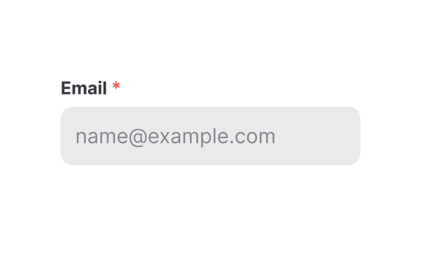
Required input
Required inputs are most commonly indicated with an asterisk or with the word "required." Letting users know which inputs are required and which they can skip over makes filling out the form a smoother, faster process.
- Should the asterisk follow or precede the input's label? Putting it before the label may help users of left-to-right languages more quickly identify required inputs while scanning the form.
- Should the asterisk be red? Not necessarily, but red is often associated with something that grabs attention. You can use your brand color if it's contrasting enough. The only recommendation is to try to avoid pale gray that users may not even notice.[1]
Pro Tip: To slightly reduce cognitive load, you may also mark optional fields with the word "optional."

