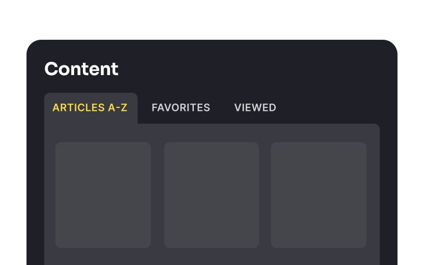
Use tabs in the correct context
Navigational tabs look exactly like real-world tab dividers in files or tabs on folders in a file drawer. That's why they should look and work how people expect them to. Tabs allow designers to save space and present information in logical chunks. Thus, users don't feel overwhelmed with tons of content and can comfortably navigate it.
It is a good idea to use tabbed navigation in your interface when:
- You have between 2 to 9 different categories of content
- Category names are relatively short but meaningful
- The number of categories is fixed
- The categories are similar in nature and won't be perceived as site navigation
- The categories fit in a single row[1]
You shouldn't use navigation tabs if users need to compare multiple content groups simultaneously. It strains their short-term memory and increases cognitive load.


