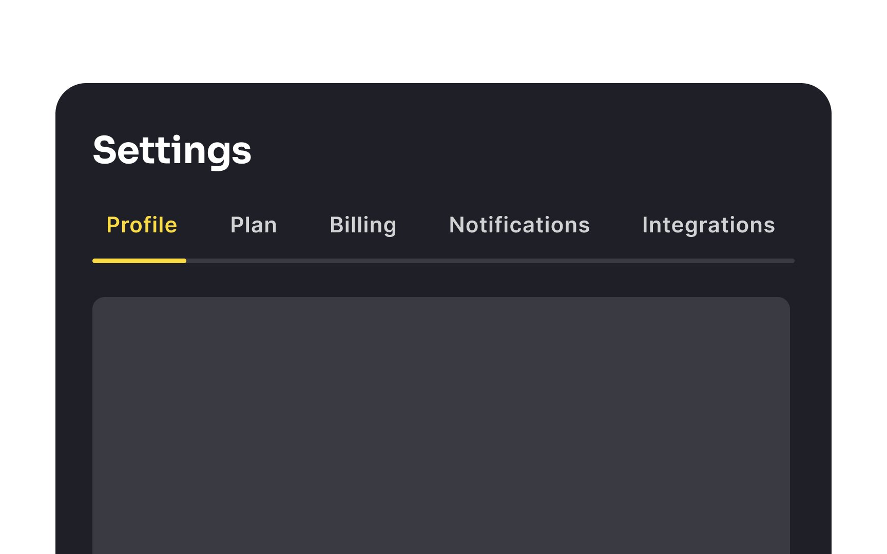
Use white space as dividers
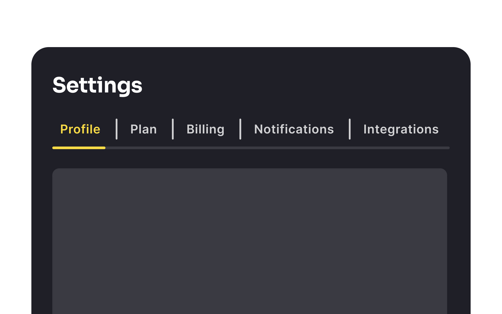
Horizontal menus that use vertical dividers between tabs can often look awkward and cluttered, especially if there are many tabs. These dividers are best used only when necessary — for instance, when simply spacing the tabs apart doesn't provide enough visual separation.
In designs where tabs are fewer and more spread out, leaning on white space for separation is usually more aesthetically pleasing. It creates a cleaner, more streamlined look, avoiding the heavy and cluttered appearance that vertical dividers can sometimes cause.
Top contributors