Maintain readability
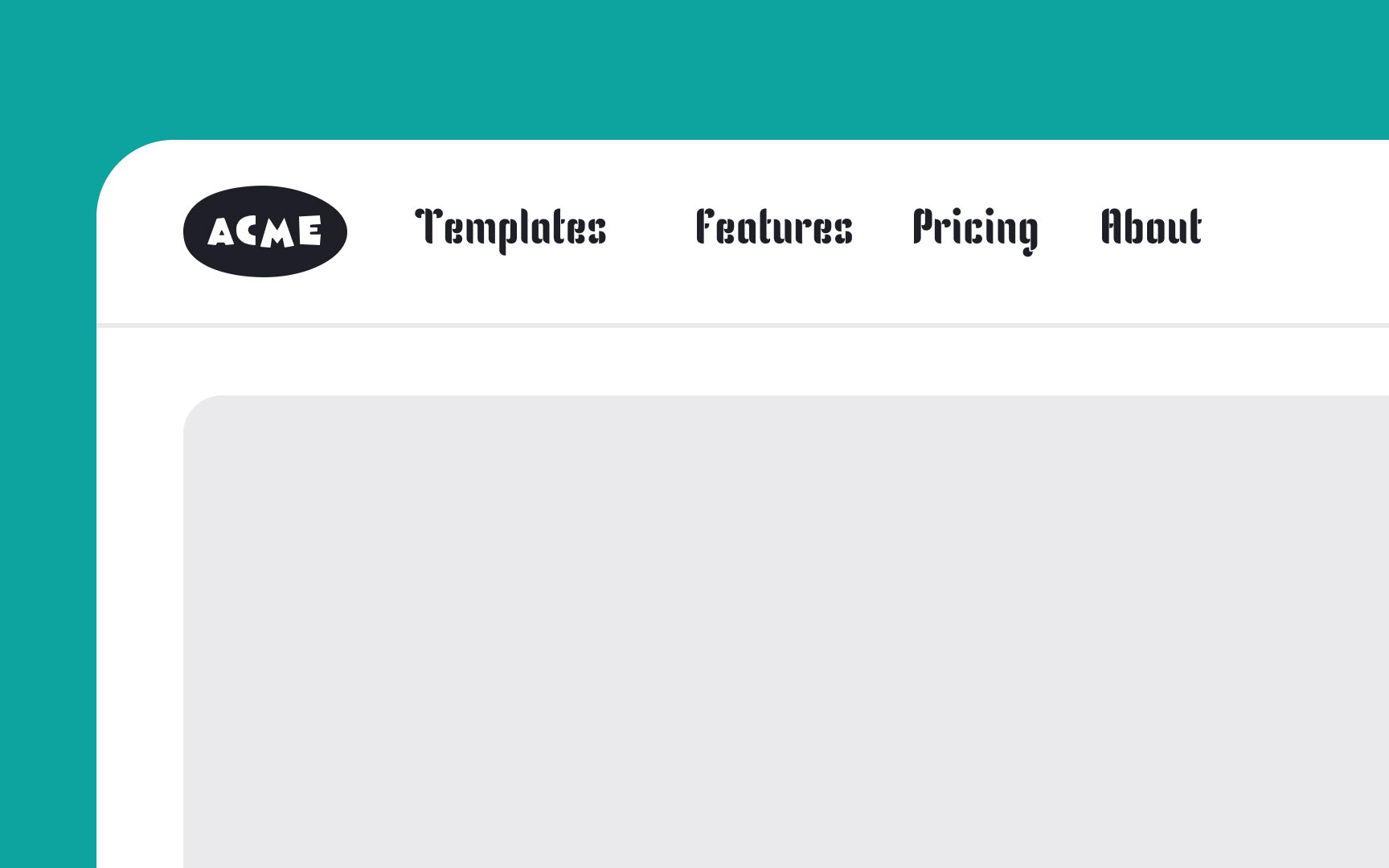
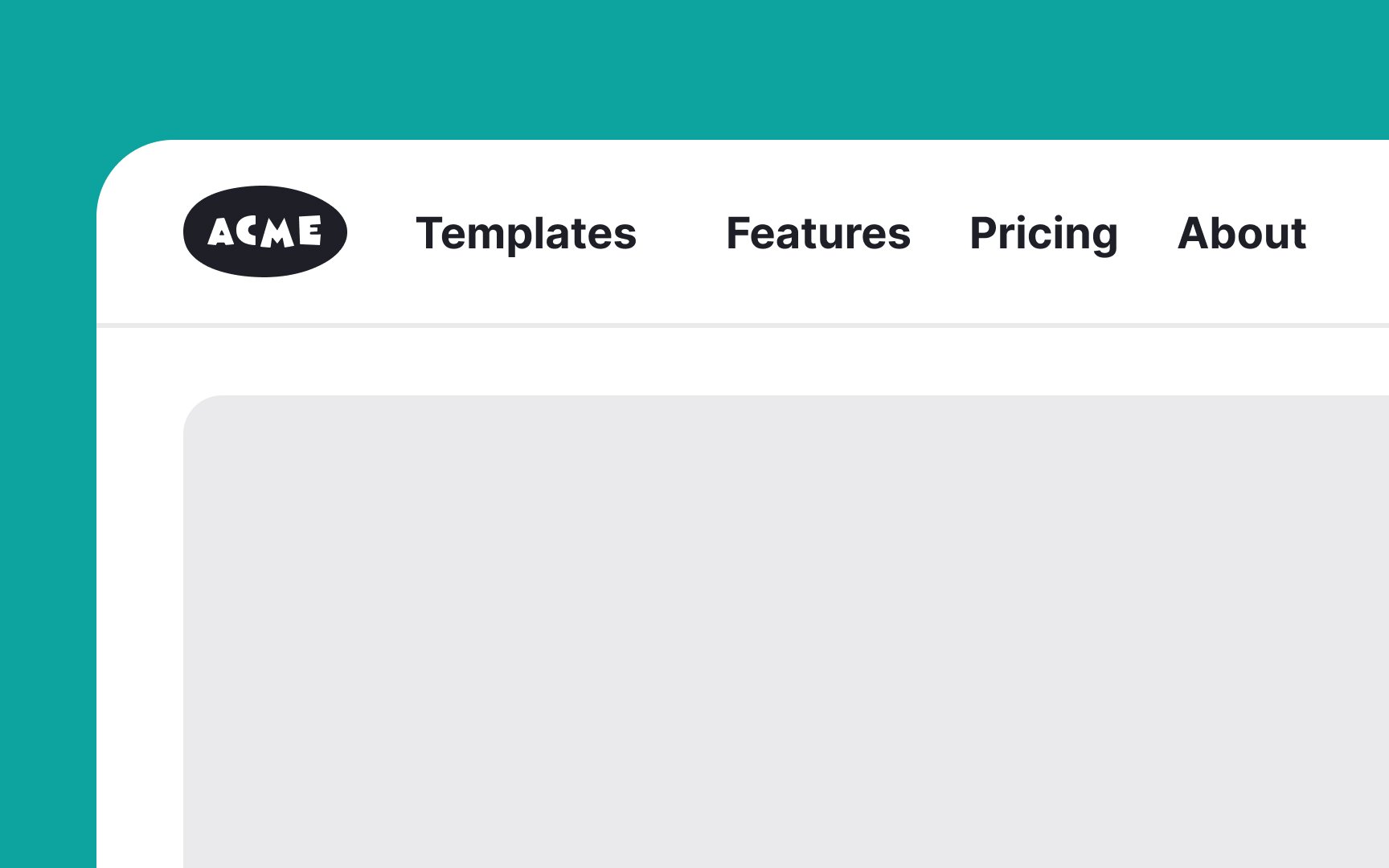
A complex or overly decorative typeface might appear visually appealing for a header, but it's not effective if users struggle to read it. Readability is key for ensuring that information is accessible and understandable to all users.[1]
In selecting a typeface, it's important to consider how it aligns with the brand's voice and personality. The font should resonate with the brand's image and values, and also be appropriate for the specific product or service offered. For instance, a playful, whimsical font might be suitable for a children's app, while a more professional, clean typeface would be better for a business website.
Pro Tip: Avoid any handwritten or heavily stylized fonts for headers.
