Scatter plot
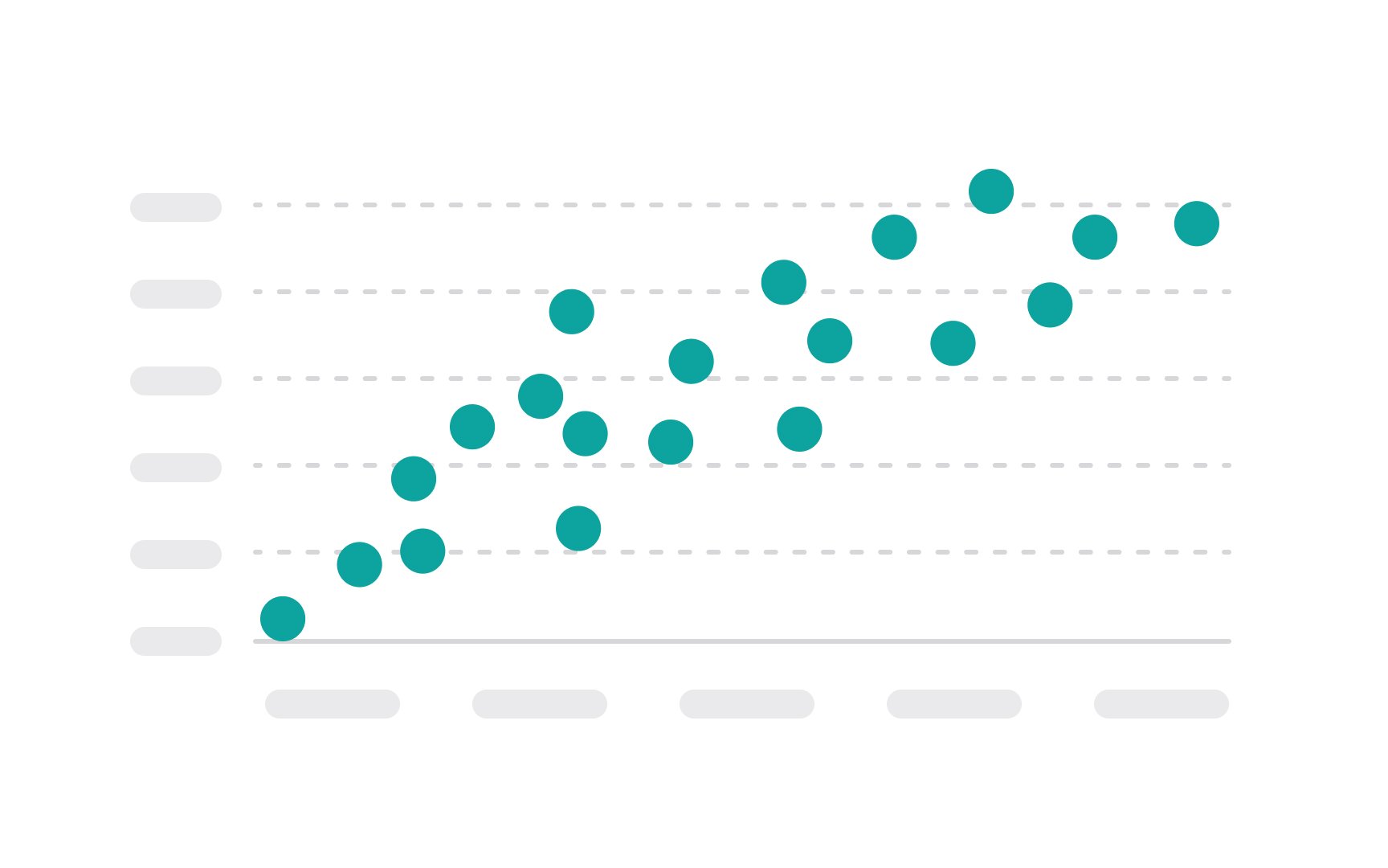
A scatter plot uses dots to represent the values obtained for two different variables — one plotted along the x-axis and the other plotted along the y-axis. Each point on the scatter plot represents an individual data point.
The main purpose of a scatter plot is to show how much one variable is affected by another, or to show the distribution trends. It's a valuable analytical tool in statistics and data analysis for identifying correlations between variables, spotting outliers, clusters, and trends. For example, in a scatter plot comparing the relationship between exercise and weight loss, each point would represent a different person, with their amount of daily exercise on the x-axis and their weight loss on the y-axis.
Patterns in the scatter plot might reveal correlations, such as whether more exercise generally leads to more weight loss. Keep in mind that plotting too many data points can result in overlapping, making it hard or even impossible to identify relationships between variables.[1]