Radar chart
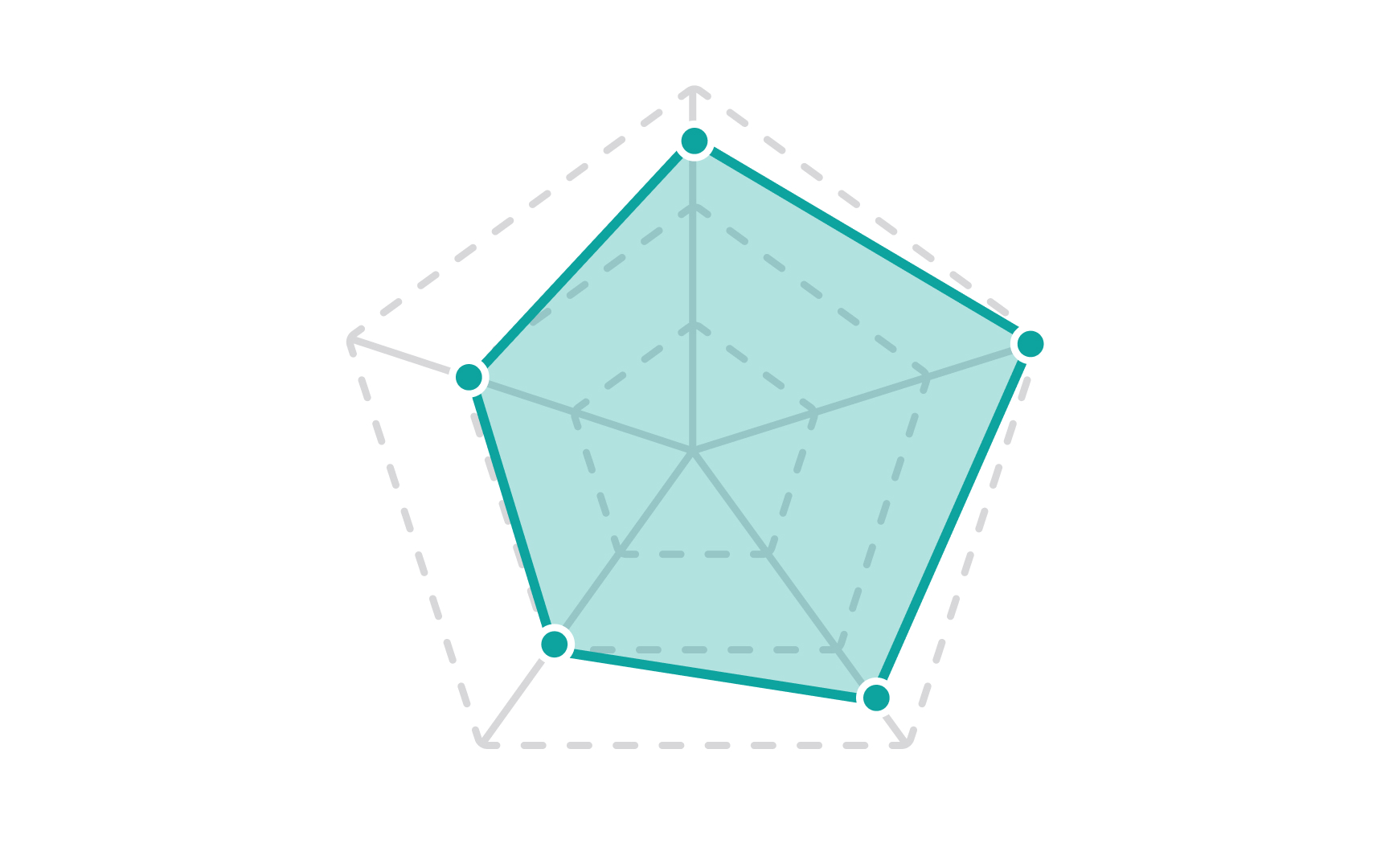
Radar charts, aka spider charts or web charts, are used to outline one or more groups of values over multiple variables. For example, radar charts can help compare different health metrics of different people in a group or visualize the performance data of each person in a team.
While radar charts are a good choice for comparing multiple variables, they may be hard to interpret if you use too many or too distinctive variables or have multiple color-filled polygons in one radar chart.
