Line chart
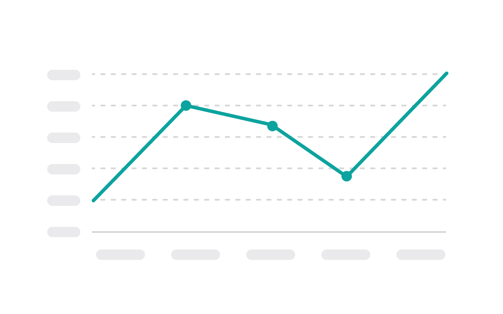
A line chart is used to display information as a series of data points, known as markers, connected by straight line segments. It's one of the most basic and commonly used chart types, typically used to show trends over time or continuous data.
In a line chart, the X-axis often represents a time interval or a sequence of values, while the Y-axis represents the scale of the values being measured. Each data point on the chart corresponds to a specific value on each axis. When the points are connected by lines, they show the rate of change between the data points, making it easy to see increases and decreases, patterns, or trends.
In contrast to bar charts, line charts shouldn't start at a zero-value baseline. Remember, we need to observe the behavior of a metric over a value (e.g., time) rather than its magnitude.[1]