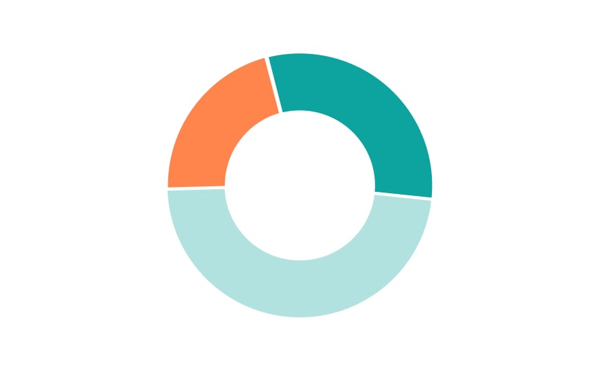
Donut chart
A donut chart is similar to a pie chart but has a blank center, creating a ring shape rather than a solid circle. This central space can be used for additional information or simply to make the chart more visually appealing. The main difference from a pie chart is aesthetic, but this hole in the middle can sometimes make it easier to read, especially when comparing multiple charts or dealing with small segments.
When choosing between a donut and a pie chart, consider the complexity of your data. Donut charts can be more effective when you have a large number of categories or when the differences between them are subtle.

