Candlestick chart
A candlestick chart is a type of financial chart used to describe the price movements of a security, derivative, or currency over time.
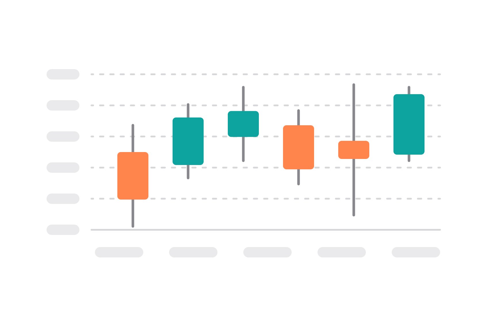
The main part of the candlestick is the "body," which represents the range between the opening and closing prices. If the closing price is higher than the opening price, the body is often white or unfilled, indicating a price rise. Conversely, if the closing price is lower, the body is usually black or filled, indicating a price drop. Thin lines called "wicks" or "shadows" extend from the body's top and bottom to show the period's high and low prices. These provide additional information about price variability within the trading period.[1]
Candlestick charts are highly valued for their ability to provide a quick, clear picture of market trends and potential reversals, making them a favorite among traders.
