Area chart
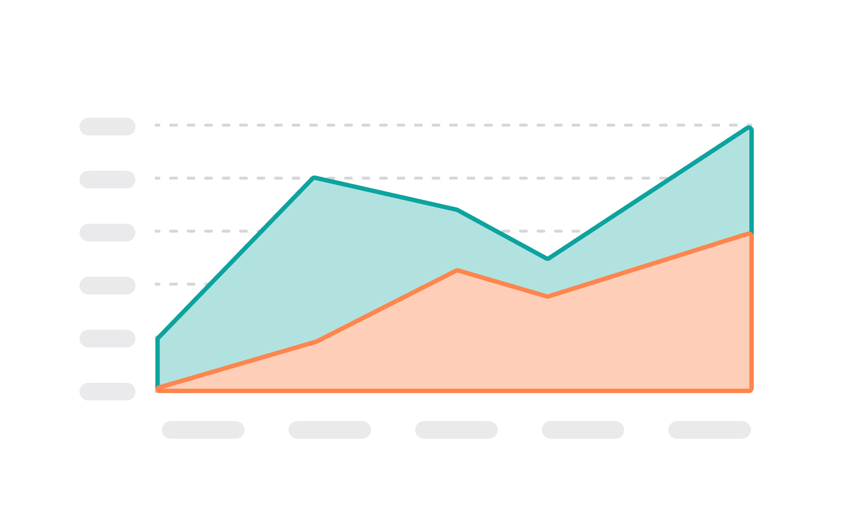
If you take a line chart and color the white space underneath it, you'll get an area chart.[1] Like line charts, single area charts are also good at representing how things change over time — for example, students' performance throughout the year.
Generally, when we say "area chart," we imply the stacked area chart, where each region illustrates its contribution to the total. For example, you can use stacked area charts to display the number of active users who have a free plan, a basic plan, and a premium plan. Overlapping area charts allow us to compare the values between groups. They can be quite confusing to read if you have more than two areas.
To help users read area charts with less pain, it's a good idea to select the right order of areas. Usually, the most stable and large ones should lay the foundation, while the most variable or smallest groups should go on top.
References
- Chart Types: Area Charts, Stacked Area Charts, and 100% Stacked Area Charts | Spreadsheet.com Support
