Left-align breadcrumbs to simplify scanning
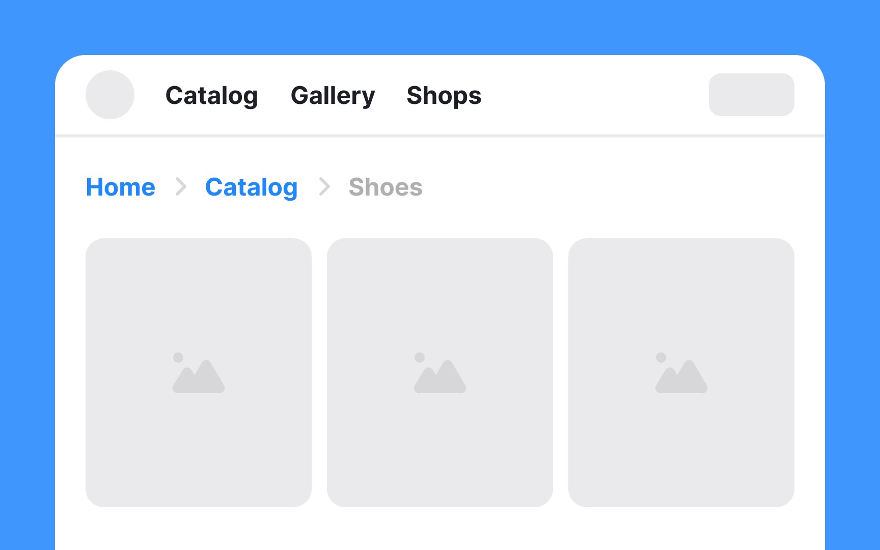
For websites catering to audiences who read from left to right, breadcrumbs should ideally be left-aligned. This alignment aligns with the natural reading flow, making it intuitive and easy to follow for users.
Conversely, for websites designed for right-to-left reading audiences, like those in Arabic or Hebrew, right-aligning the breadcrumbs is the most logical approach.
Center-aligned breadcrumbs can appear out of place and may disrupt the legibility and overall flow of the page. Consistency in alignment is key — if the general layout of a website aligns elements to the left, then breadcrumbs should follow this pattern to maintain a cohesive design.
