Readability
Everybody knows the conventional wisdom in the design world: you should be exceptionally careful when selecting a typeface so that the text in your designs looks readable. Or is it legible? Or do these terms, legibility and readability, mean the same thing?
Legibility refers to the typeface's design and the shape of the glyphs and falls under the influence of typographers. In contrast, readability is more about the readers' perception of the text and how easily they can decipher, process, and make meaning of it. Readability is the responsibility of copywriters and UX writers. However, typographical features of the text have a profound impact on the text's fluency and comprehension.
What typographical factors affect readability?
- Type size: The smaller the size, the harder the type is to read. From an accessibility standpoint, it's generally recommended to set body text at no less than 16px.
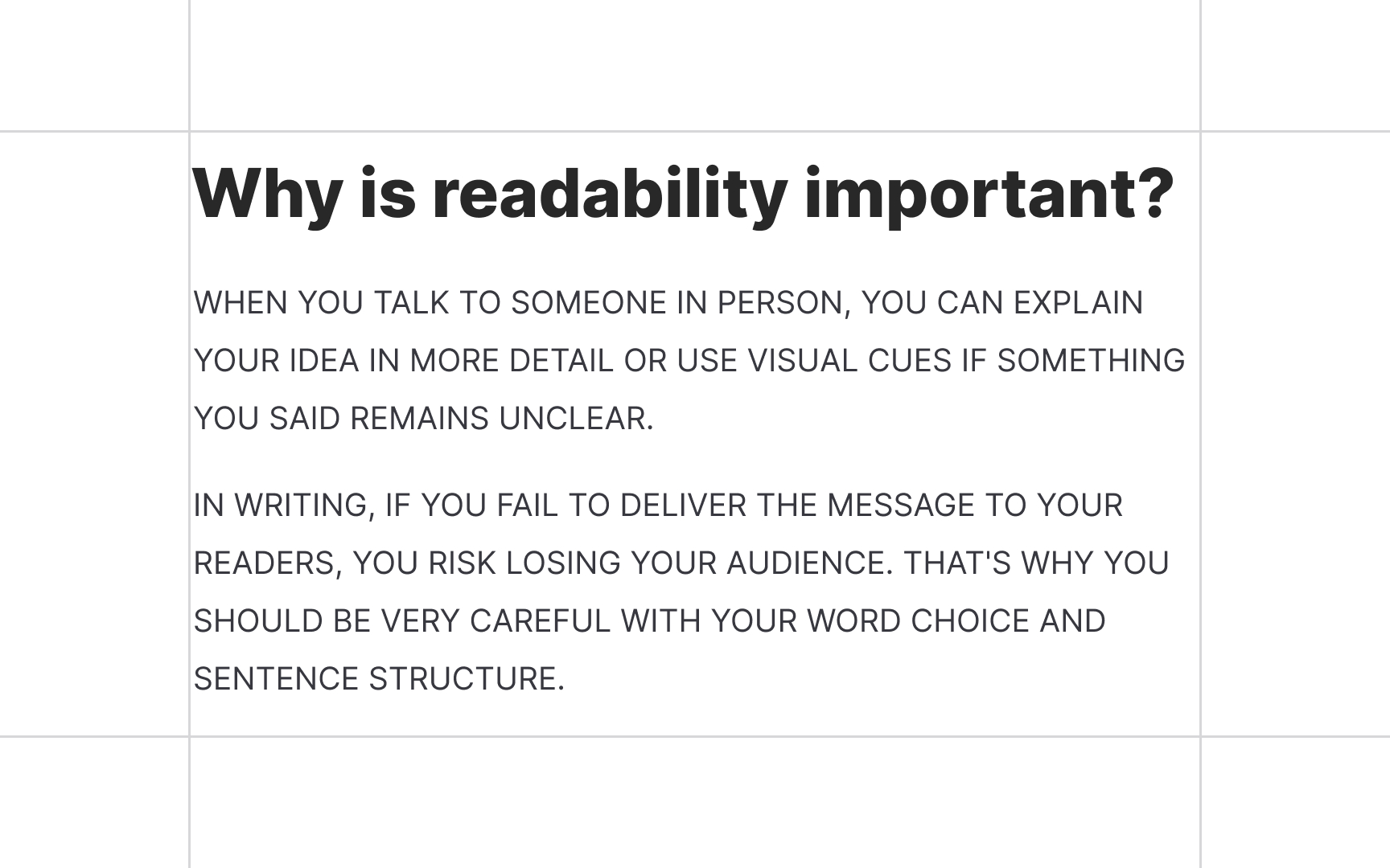
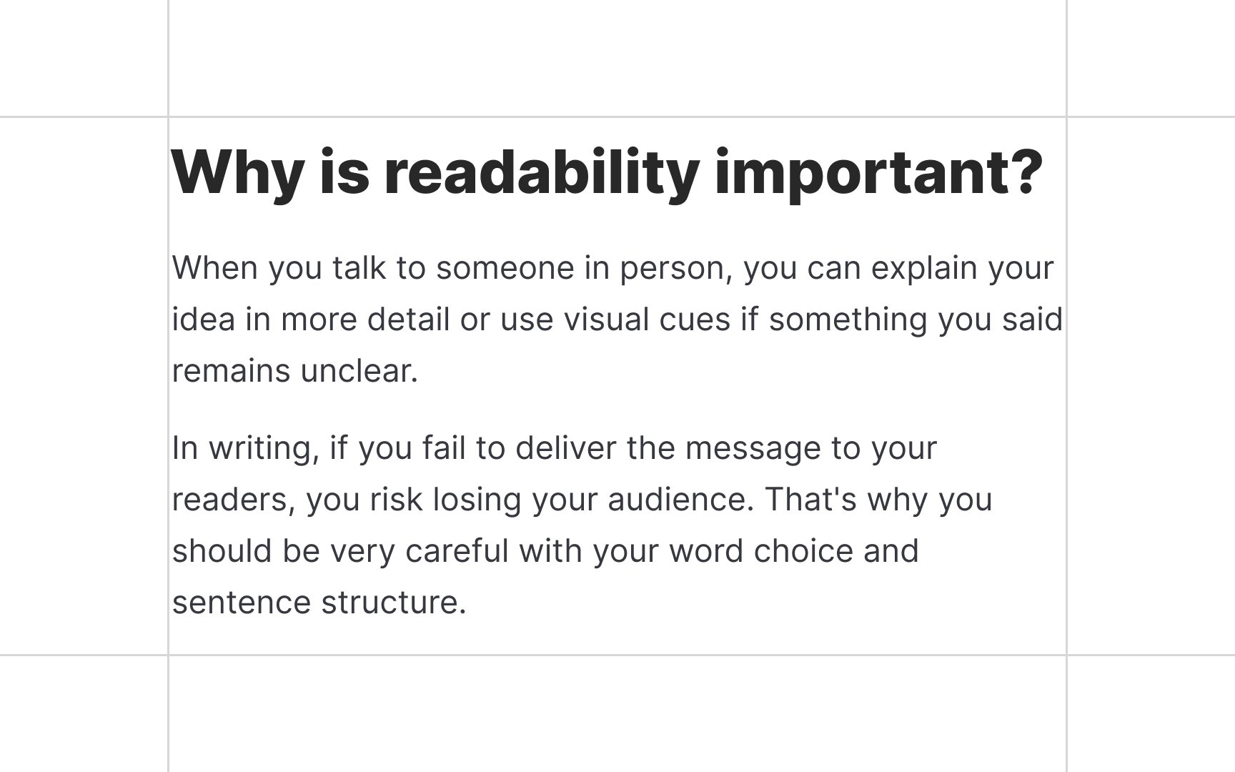
- Type case: While headlines and short phrases (like captions or subheads) get along with all caps and title cases, you should avoid these cases for body text. Sentence case is the most natural for people — after all, that's how we learned to read and write.
- Line spacing (leading): Line spacing depends on the size of the font. The larger the font is, the bigger the line spacing should be to avoid letters overlapping.
- Line length: Long lines are hard to follow. Short lines are no better. They're too abrupt and wear on users' attention, forcing their eyes to go back and forth too often. The optimal line length is 45-70 characters, including spaces.[1]
- Contrast: Low text-to-background contrast ratio increases eye strain and dramatically affects usability.
References
- Legibility and Readability: What’s the Difference? | CreativePro Network | CreativePro Network
