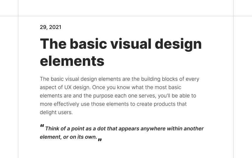
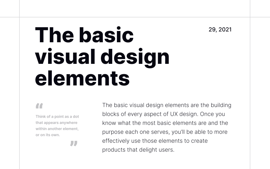
Complex alignment
Good design is far more than just choosing typefaces, placing text on a page, and calling it a day. It's essential to create a solid typographic hierarchy that influences in what order users scan the content. Commonly, it depends on the typeface, font size, weight, case, style, spacing, alignment, and other essential aspects.
Traditionally, in left-to-right languages, body text is left-aligned to provide a higher level of scannability. Right alignment is used to create balance or contrast, while center alignment is rare and mainly applied to headlines. To generate interest and guide user attention, designers can leverage complex alignment — a combination of several alignment types in one composition.
This method allows designers to break from tradition and experiment with positioning text elements such as pull quotes, captions, headings, and body text. In combination with contrasting font weight, size, spacing, and style, you can create ingenious compositions to reinforce the product's message.


