Grid anatomy
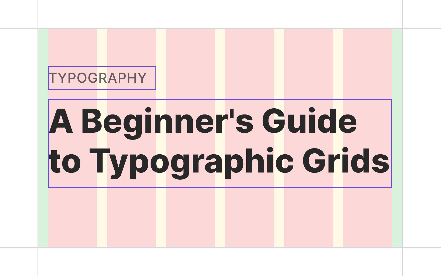
Essentially, a grid's anatomy is made of two basic vertical components — columns and gutters. Columns define the widest areas that hold content within the grid, while gutters refer to the space between columns. Technically, each grid also has margins — gutters on the outer edges of the content.
The bigger the number of columns, the more flexible the layout becomes. On the other hand, it gets harder to manage. You can let your content dictate the number of columns or stick to traditional numbers — 12 on desktop, 8 on tablet, and 4 on mobile.
To achieve a nice balance between elements both horizontally and vertically, it's recommended to keep the gutter width the same size as the baseline height (for desktop and tablet) or at half of the line-height (for mobile).[1]
