Color
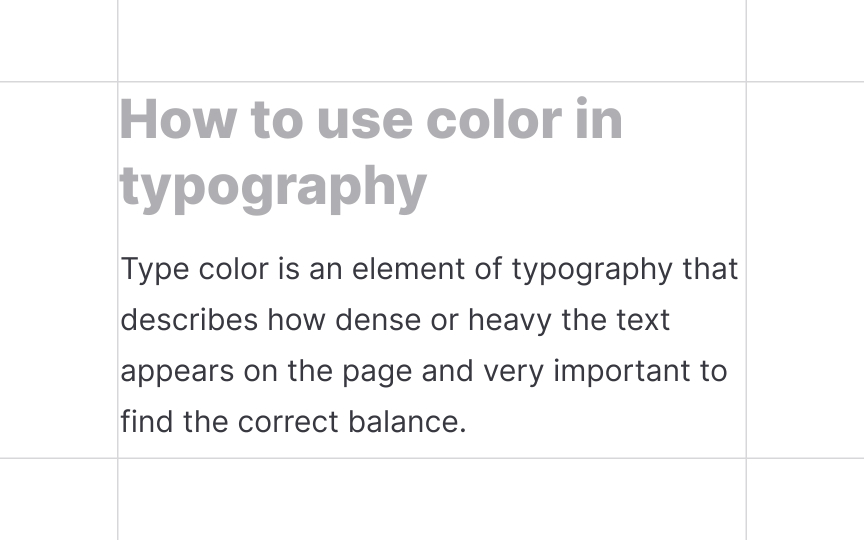
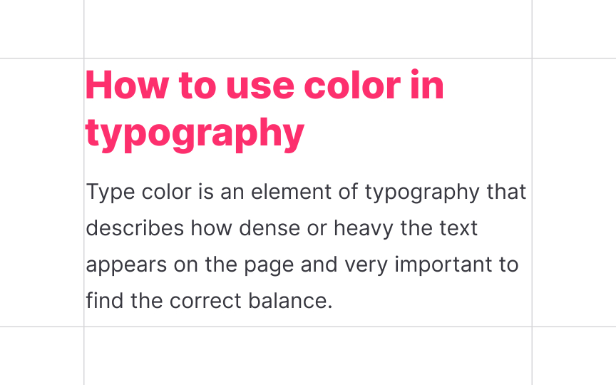
Color is an obvious but tricky method of creating contrast. Designers have to be very careful selecting the colors of fonts and the background and keep accessibility a priority. According to WCAG 2.0 level AA recommendations, the color contrast ratio should be at 4.5:1 for normal-sized text and 3:1 for larger text.
Also, if stepping away from the traditional dark font/white background formula, think carefully when selecting and combining colors. They should create the right mood, communicate the message, and reinforce brand identity, while maintaining readability.
Pro Tip: Avoid relying solely on color to create contrast and draw attention. Users with some visual impairments will have trouble spotting the difference and may overlook an error or warning.


