Be consistent
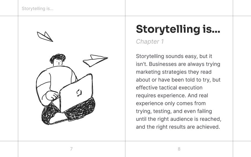
One of the main functions of typographic design is to create structure and hierarchy. A good hierarchy isn't possible without consistency, as it shows the relationship between typographic elements. This means that similar elements are similarly styled. For example, headings are bigger than the body text, and all headings are styled similarly. These visual cues help users understand what they are looking at. Elements of the same type should look the same, while different elements should have different styles.
Even though you may have many hierarchy levels, stick to an overall theme for the design. In the example, hierarchy is created mostly by size and color. The design only uses 2 font faces; all text is left-aligned except the page number, providing clean, consistent lines. Overall, it looks crisp and clear. Adding more fonts, colors and alignments would create a messy and confusing design.

