Contrast without conflict
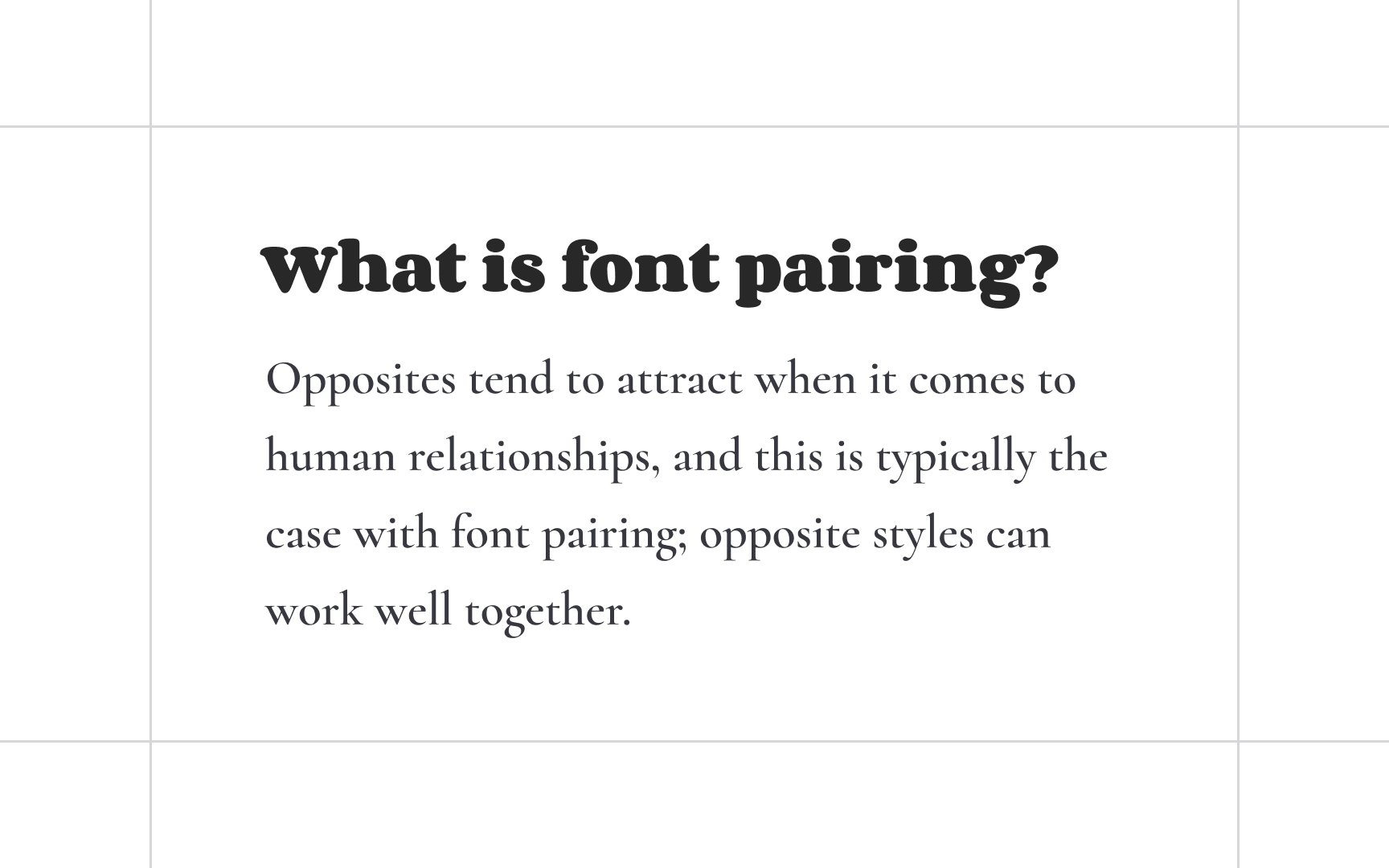
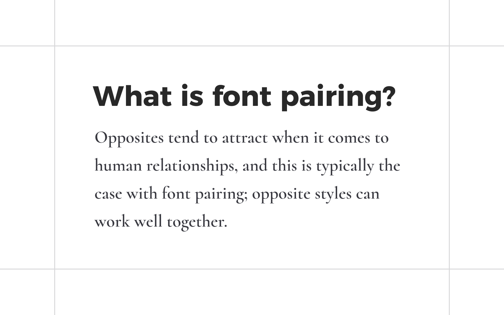
The contrast between typefaces has a lot of positive influence in allowing each typeface to stand out, show its individuality, and highlight important information. Too much contrast between typefaces, on the other hand, can cause a clash and confuse users. Or worse — hurt readability.
How much contrast is too much? Consider parameters such as x-height, cap height, the contrast between thin and thick strokes, vertical stress, proportions, and spacing — at least some of them should be similar. If you try to combine a chunky, bold font like Corben with an exquisite, elegant Cormorant, they can appear too different or conflicting.
Sometimes, you have to rely on your gut feeling and a sense of balance and aesthetics to decide what combination of typefaces works and what does not.
