Ligatures
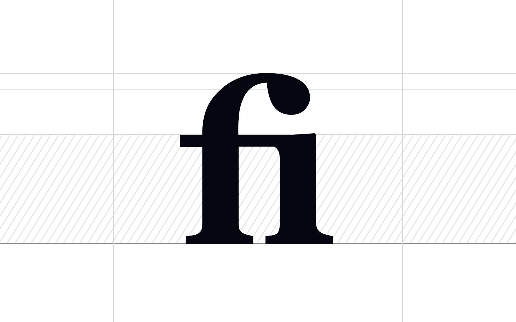
In typography, a ligature is a combination of two or more graphemes or letters joined into a single glyph. The most common ligatures, like fi, fl, and ff, involve the lowercase f because of its overhanging shape. Another famous ligature is an ampersand (&), representing a combination of the old handwritten Latin letters e and t from the word et, meaning "and."
Depending on their role in the text, ligatures can be broken down into 4 types:
- Standard: Ligatures like fi, fl, ff, ffi, ffl, and ft exist in order to increase legibility and make this collision of letters more attractive.
- Discretionary: Those ligatures may include ct, fs, st, sp and serve a decorative function, creating a more old-fashioned look.
- Unusual or Uncommon: May include standard and discretionary ligatures that are rarely encountered in text, like fj, fk, or ij.
- Long s: These are usually discretionary ligatures involving a long s combined with h, l, i, or t.[1]
References
- Basics of Ligature in Typography and Publishing | ThoughtCo
