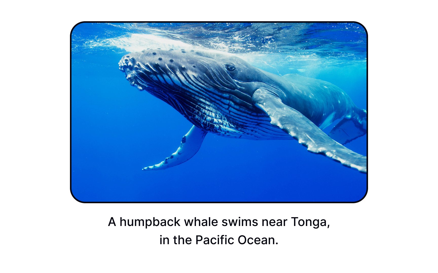
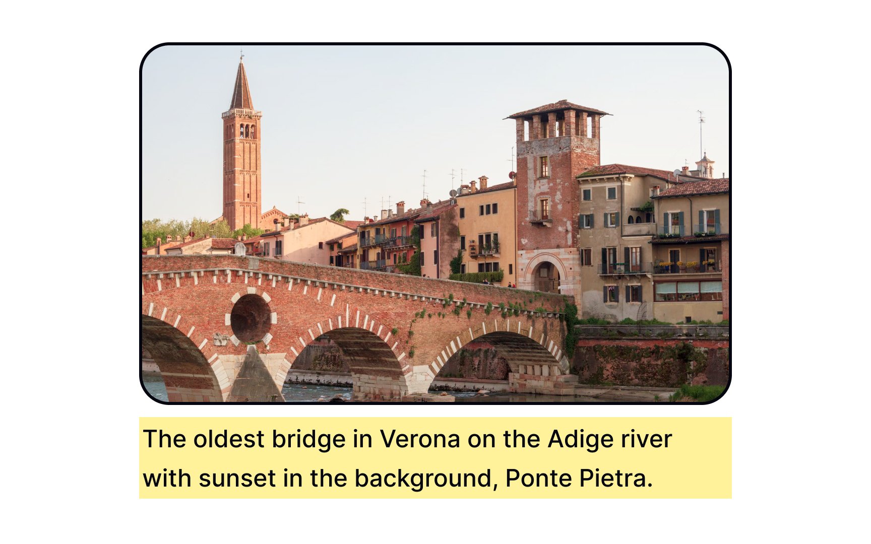
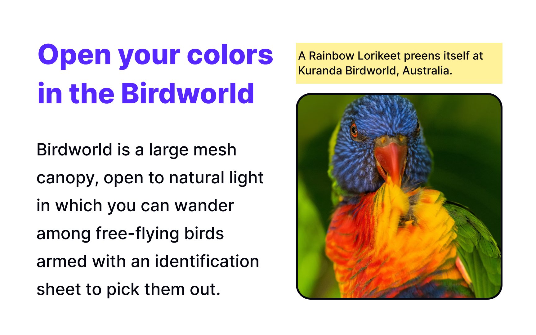
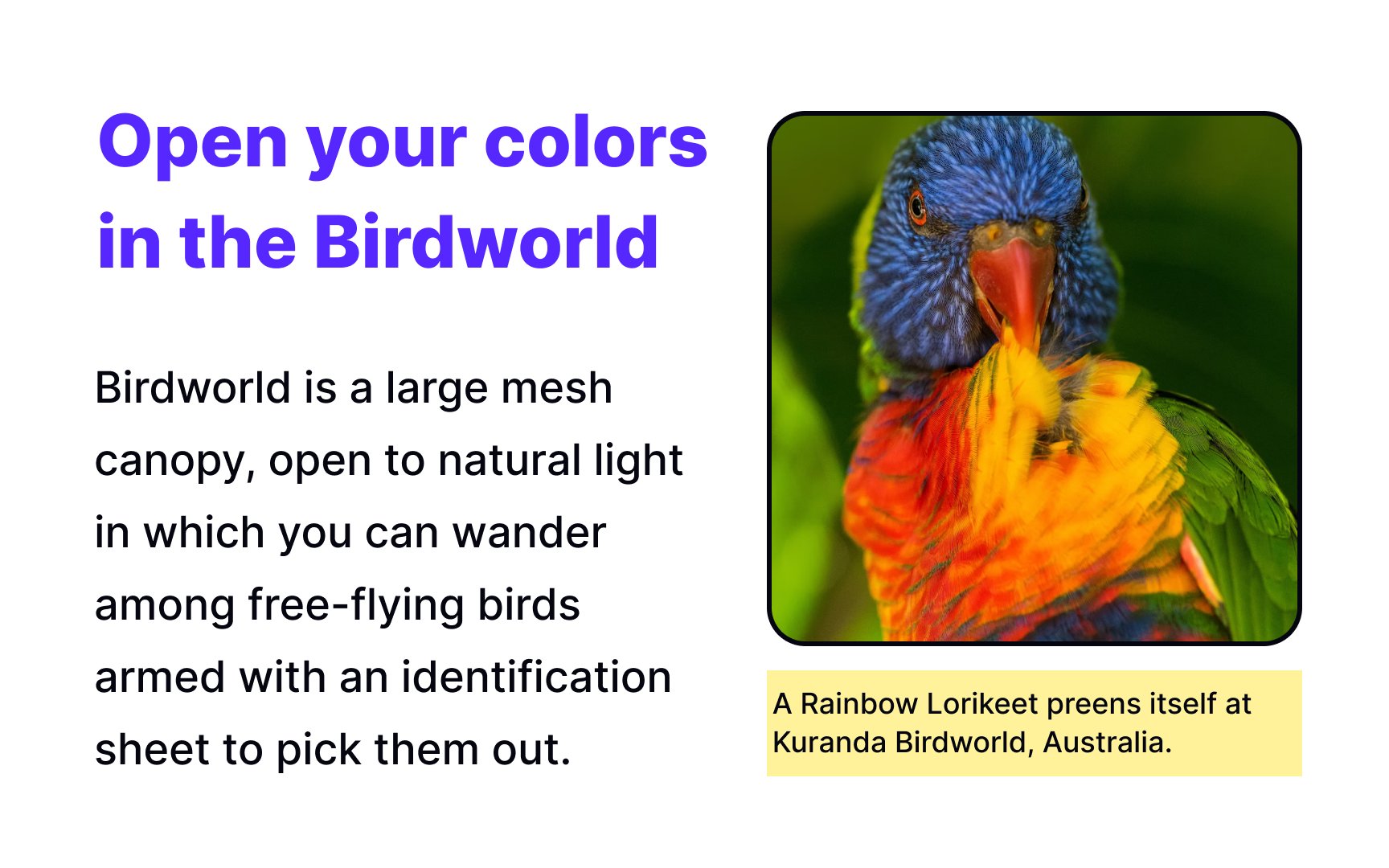
Captions in Typography
Discover how to use captions to help users scan a page faster and gain essential information at a glance
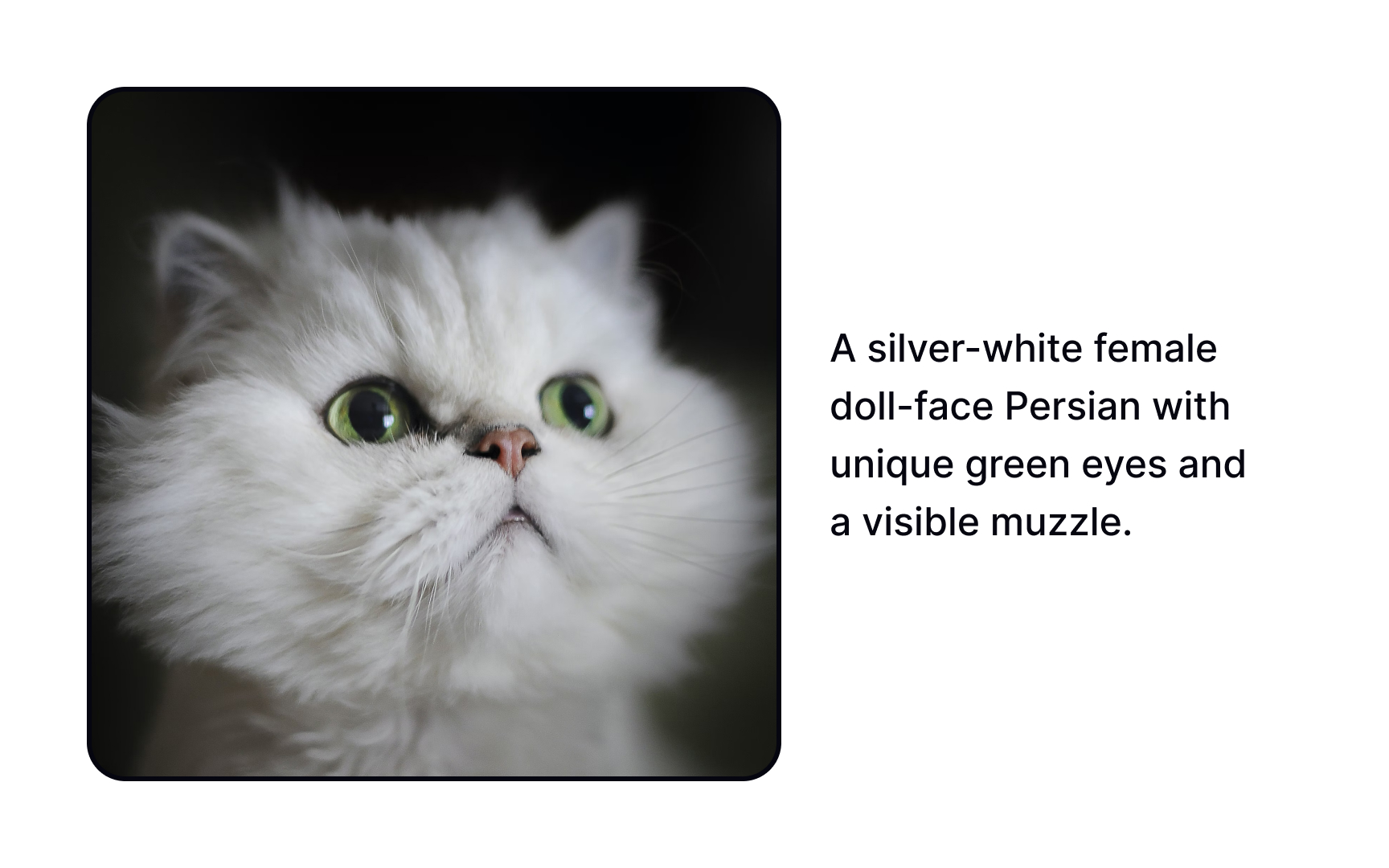
Image captions usually go unnoticed until you really need them. They play a vital role in helping users scan a page faster and gain essential information at a glance. They also aid in the product's accessibility, allowing users of screen readers access visual content. When designed properly, captions can also contribute to the visual representation of the brand.

In the typography hierarchy, captions represent the smallest font size on a
Captions work like anchor points helping users skim the content and catch on to only the most relevant information for them. Apart from that, captions provide extra context to visual content and assist users with visual or cognitive impairments.[1]
Pro Tip: Provide captions for all images except decorative ones that contain visual interest but convey no information.


When deciding on the typeface for captions, remember that it should remain legible at very small sizes (6-9 points).
Consider the following criteria:
- Sans serifs are more readable at smaller sizes than serifs
- The typeface should include thin variations that are more readable at smaller sizes
- The typeface has larger x-heights
- The typeface has more open counters
- The typeface has more open letter spacing[2]
Usually, captions appear quite minimalistic: black or gray text that gets positioned either to the side of or below an
When you decide to add more
As far as captions are secondary text, they should be less prominent. On average, captions are around 2 points smaller than the
One of the primary goals of captions is to accompany and briefly provide additional information about visual
Captions and alt text are in the same boat: they help users who have trouble viewing
Complex images that provide a lot of information, like graphs, diagrams, or infographics, have a strong need for captions and extended descriptions that refer to key content and titles.
Pro Tip: If captions are quite descriptive, alt text can be brief.
Any text longer than 2-3 words written in all caps turns into a shouting piece that users have trouble reading and may even lose interest in. Why does this happen?
Many studies have been conducted to explain it. One study suggests that people don't read letter-by-letter but rather recognize ascending and descending words' outlines. All caps doesn't have these variations, making it harder to read longer pieces of writing in all caps.[4]
No matter which theory you prefer, all caps feel unfamiliar to ordinary people, making text notably hard to digest. Additionally, most screen readers will spell out text in all caps letter by letter, leading to a terrible user experience. It can be okay to use all caps for headlines, subheads, labels, and other short phrases. Captions, however, appear illegible and impose a higher cognitive load.
In turn, in sentence case, letters are more distinctive, and text feels familiar and natural — that's how we have grown up reading, after all.
Pro Tip: Title case feels inconsistent and should only be used for headlines, subheads, labels, and similar short copy.
References
- Captions Part 2 - Fonts.com | Fonts.com | Fonts.com
Top contributors

Topics
From Course

Share


