The impact vs effort matrix
The impact vs effort matrix is one of the most practical tools in a product manager's toolkit. Draw a simple chart with impact on the vertical axis and effort on the horizontal axis. This creates 4 quadrants that help you see opportunities clearly.
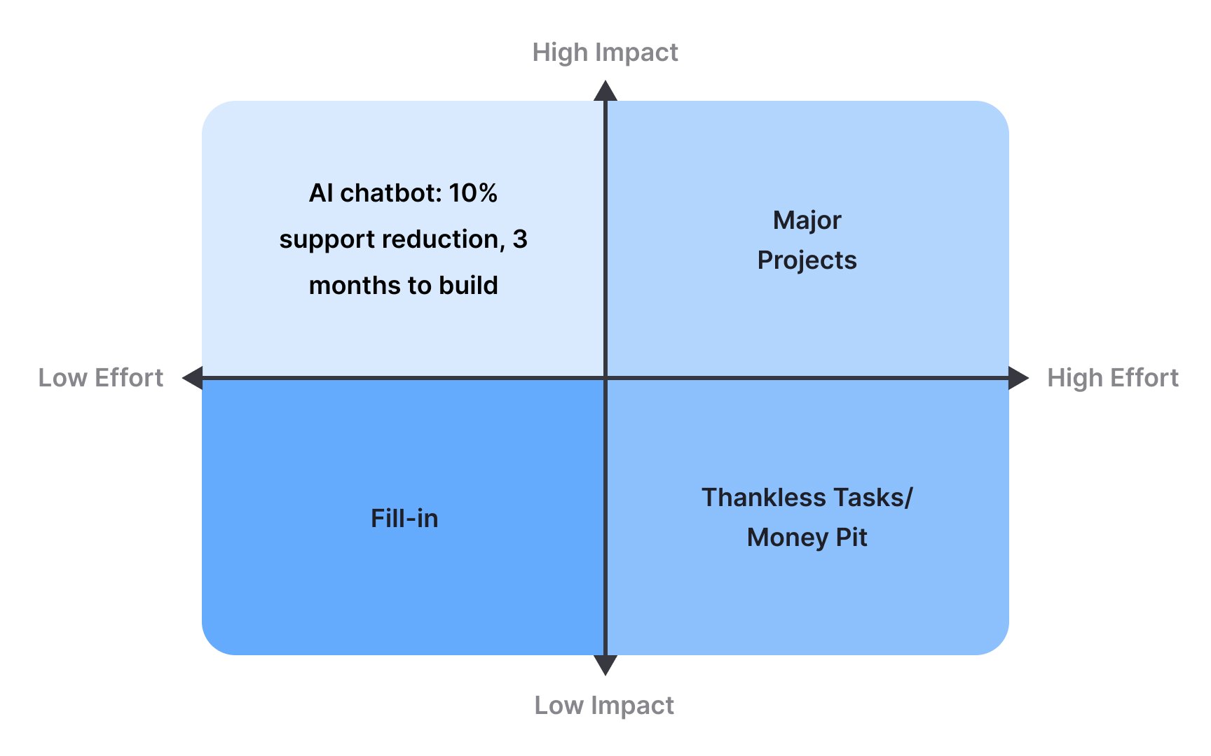
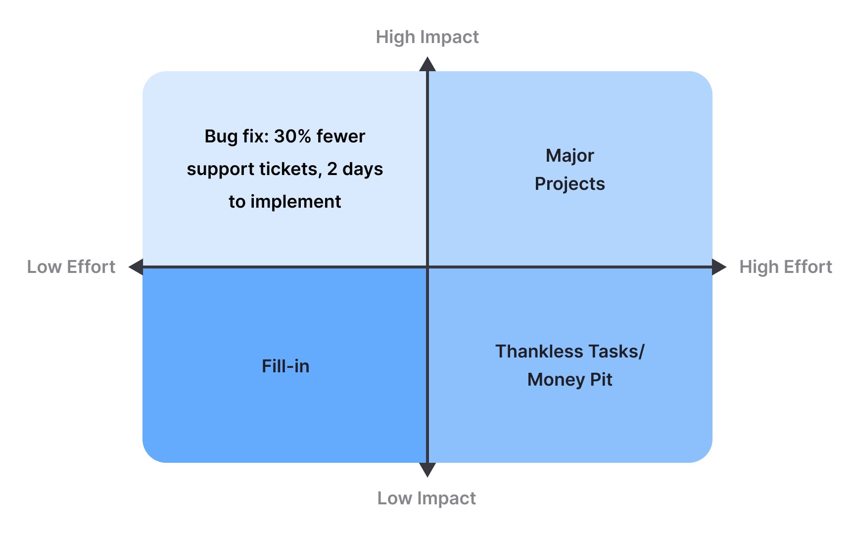
Quick wins sit in the top left corner: high impact, low effort. These are your golden opportunities. A small UI fix that reduces customer support tickets by 30% is a perfect example. Major projects occupy the top right: high impact but high effort. These might include building entirely new features or redesigning core functionality. Fill-ins land in the bottom left: low impact, low effort. Think of these as nice-to-haves you can squeeze in when time allows. The bottom right holds your "rethink" items: low impact, high effort. These rarely deserve your resources.
Most teams start with quick wins to build momentum, then tackle major projects while sprinkling in fill-ins. Items in the rethink quadrant often need more analysis or a different approach before they become viable. The beauty of this matrix lies in its simplicity. In minutes, you can plot dozens of ideas and see clear patterns emerge.[1]
References
- Impact vs Effort Prioritization – Definition and Summary | Avion – Endless customer value at scale
