Custom dashboards
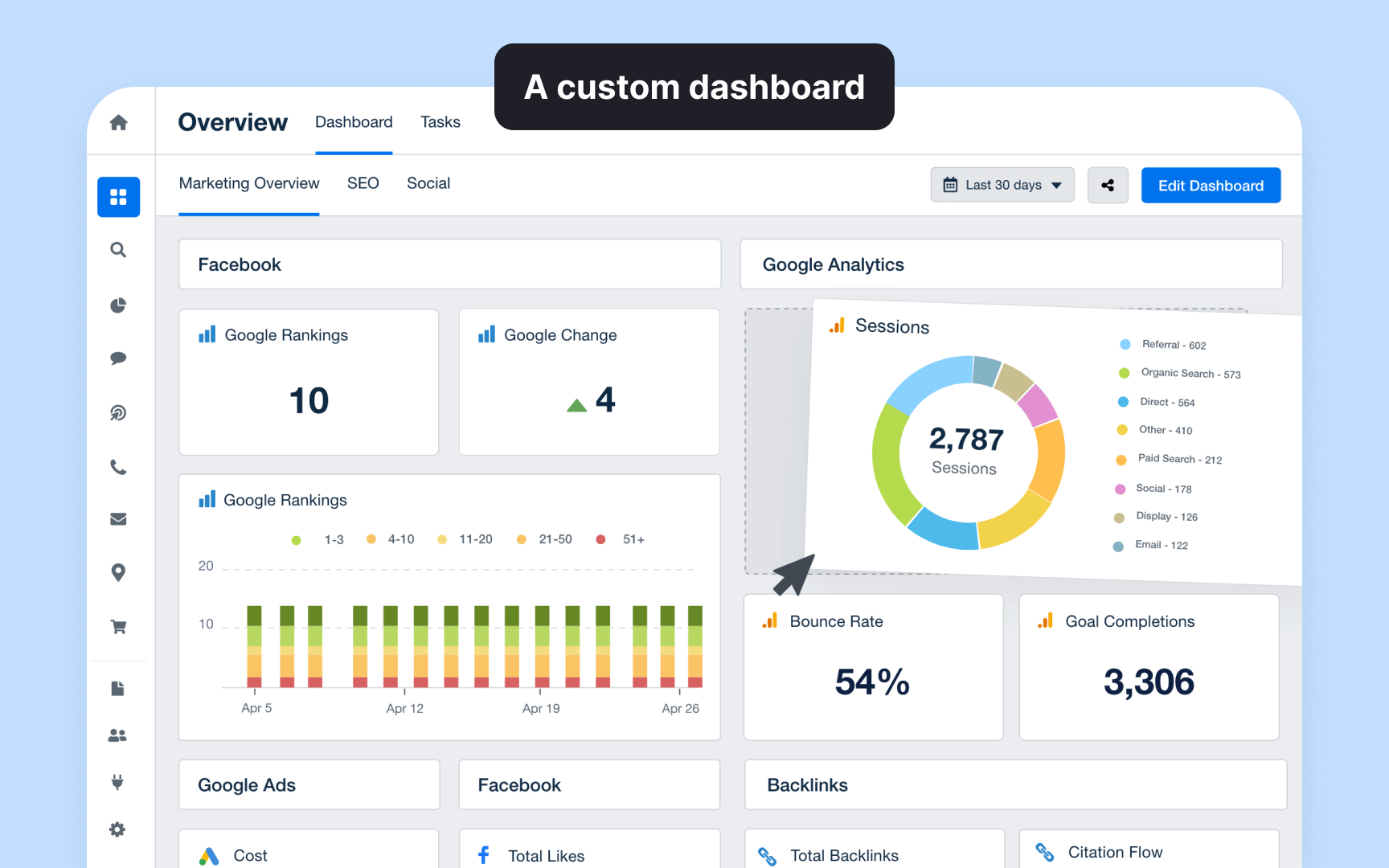
Custom dashboards transform raw analytics data into visual displays that highlight specific business metrics and KPIs. For example, a product team might combine user acquisition data, feature usage, and customer feedback scores into a single "Product Health" dashboard that updates in real-time.
The key to effective dashboard design lies in thoughtful metric selection and visual organization. A user engagement dashboard might show daily active users in a trend line, feature adoption rates in a heat map, and session duration in a distribution chart. Each visualization type is chosen based on how effectively it communicates the specific metric.
Most analytics platforms offer dashboard customization through drag-and-drop interfaces.
