Make push notifications scannable
Push notifications commonly consist of a title, body text, app icon, image, and actions that allow users to address notifications without opening an app. Depending on the operating system, messages have strict character limits and different style characteristics.
For example, Android push notifications have an app name and a small app icon provided by the system placed above the title.[1] On iOS, only the app's icon defines the sender.
How can a designer enhance the scannability of push notifications?
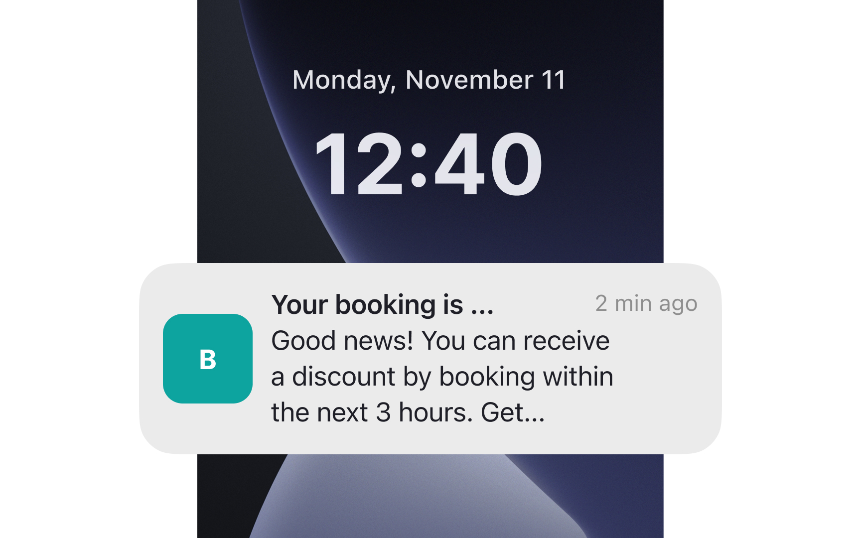
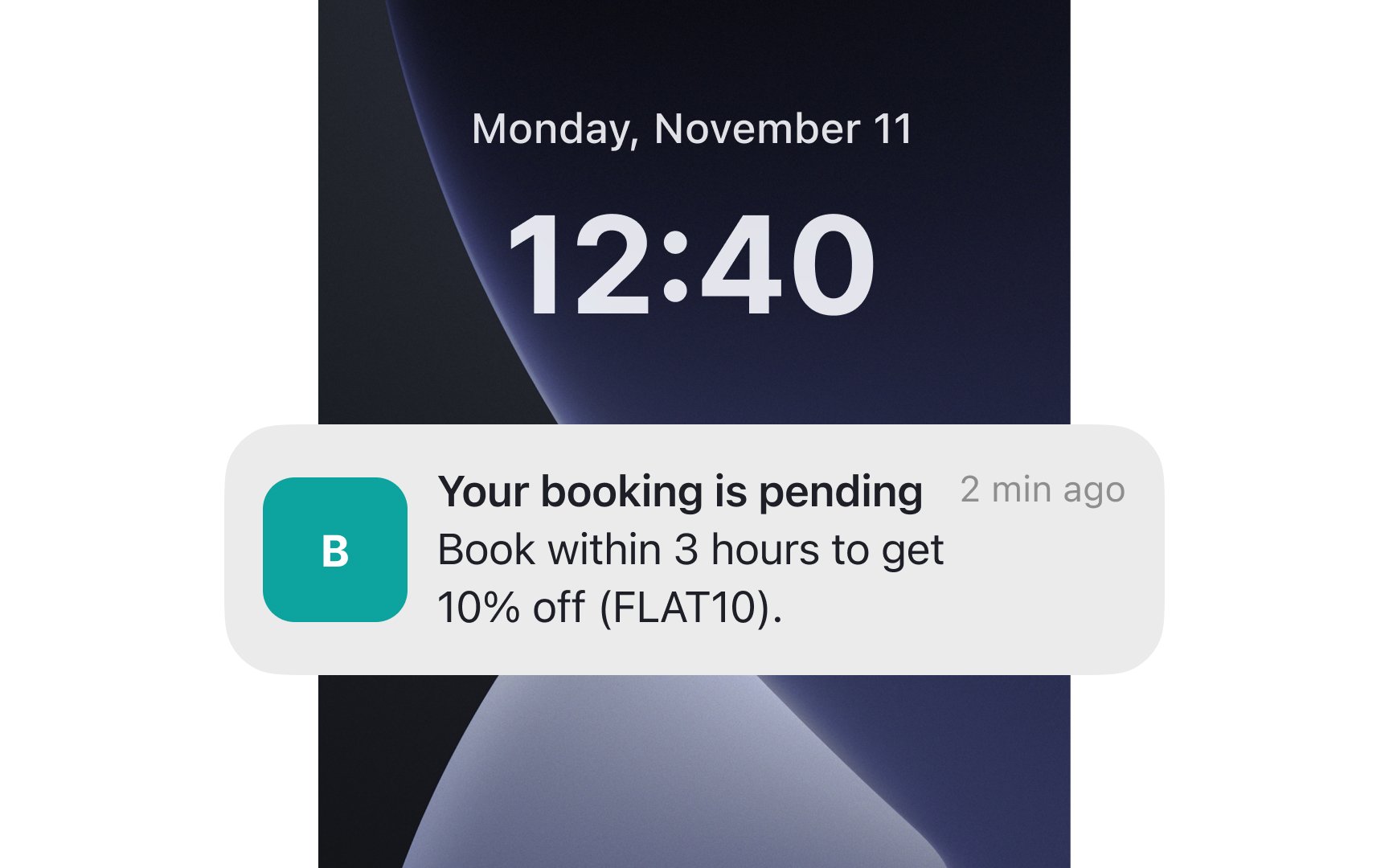
- Keep the title and body copy concise — 30 and 40 characters, respectively — to avoid truncation.
- Avoid repeating the brand name in the body copy if it's already clear from the title and icon.
- Use relevant graphics; refrain from using emojis or illustrations that don't enhance the meaning.
- Capitalize select words for emphasis, but use this sparingly.
- Employ clear and straightforward language so users immediately understand what they need to do or what to expect.
Pro Tip: Users can choose to hide notification previews in device settings. In this case, replace the default ”Notification” title and provide more descriptive text like "New Comment" or "Delivery Update."
References
- Notifications overview | Views | Android Developers | Android Developers
