Community research mapping
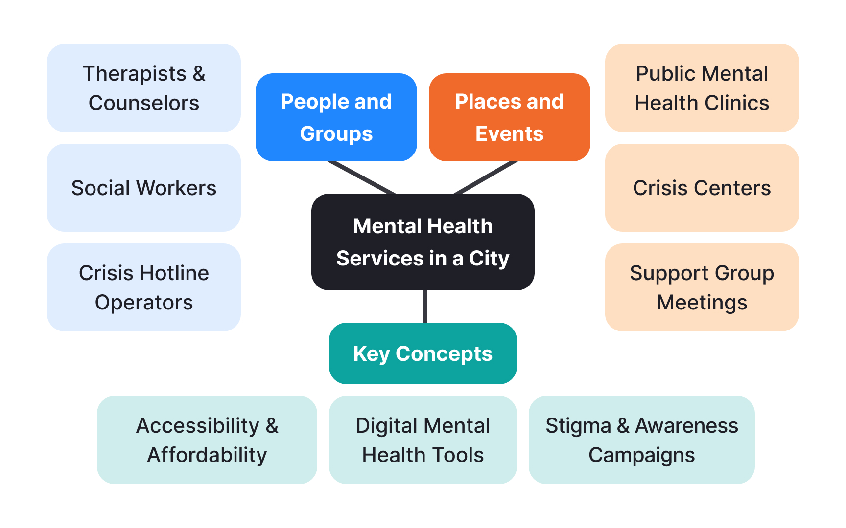
Research mapping shows how people use public services in their communities. Teams create visual maps, diagrams, and charts to understand both official government services and informal community support.
Teams track services in different ways. They mark service locations on physical maps, draw diagrams of how services connect, and create charts comparing what's available across neighborhoods. Santo Domingo's waste collection team used street maps to mark areas trucks couldn't reach, helping them spot where they needed different solutions.[1]
Simple tools work well for mapping. Teams use paper maps with color coding, basic spreadsheets, and diagrams drawn during community meetings. They also take photos during site visits and use online mapping tools to track everything from government programs to informal community help.
Key elements to map:
- Government programs and services
- Local organizations and their work
- Ways people help each other
- Available spaces and buildings
- Areas that need more services
References
- Learning with cities: prototyping and testing with communities - Centre for Public Impact | Centre for Public Impact
