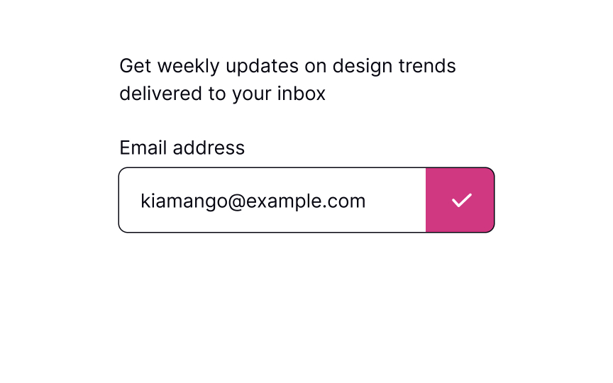
Show a button to submit
The primary action button allowing users to submit information should always be in sight. The most intuitive placement is below the form fields or in the upper right corner. On mobile, if the form is long and users need to scroll, fix the button position so it won't disappear.
The button's label should be straightforward and on-point. Users should immediately understand what happens after they press it. You can change the copy to fit the form, e.g., the button can say "Subscribe" if someone is providing their email address to receive emails.


