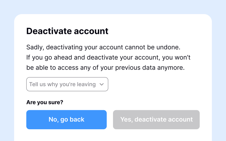
Dark pattern detection
Dark patterns are interface designs that trick users into actions they didn't intend or make it difficult to do what they want.[1] These patterns prioritize business metrics over user well-being: hidden costs at checkout, confusing unsubscribe flows, pre-checked boxes for unwanted services, or interfaces that make saying "no" harder than saying "yes."
Detecting dark patterns in your own work requires honest evaluation. Many emerge gradually as teams optimize for conversion rates without questioning the methods. Review user flows with a simple test: Would this design work the same way if it benefited users instead of the business? Look for friction applied inconsistently, like making sign-up easy but account deletion difficult. Question defaults that favor the company, like opt-in settings for marketing emails.
Establish team practices that catch dark patterns early. Include "respectful design" as a design review criterion. Track support tickets that indicate user confusion or frustration with specific flows. Create space for team members to raise concerns without being dismissed as obstacles to business goals. The most effective detection happens when teams value user trust as much as conversion rates and understand that dark patterns create short-term gains at the cost of long-term credibility.

