Keep responsiveness in mind
Wireframes should illustrate how text behaves across different screen sizes. Responsive text handling involves decisions about font scaling, line length, and how content wraps or truncates when space is limited. These decisions affect readability on every device.
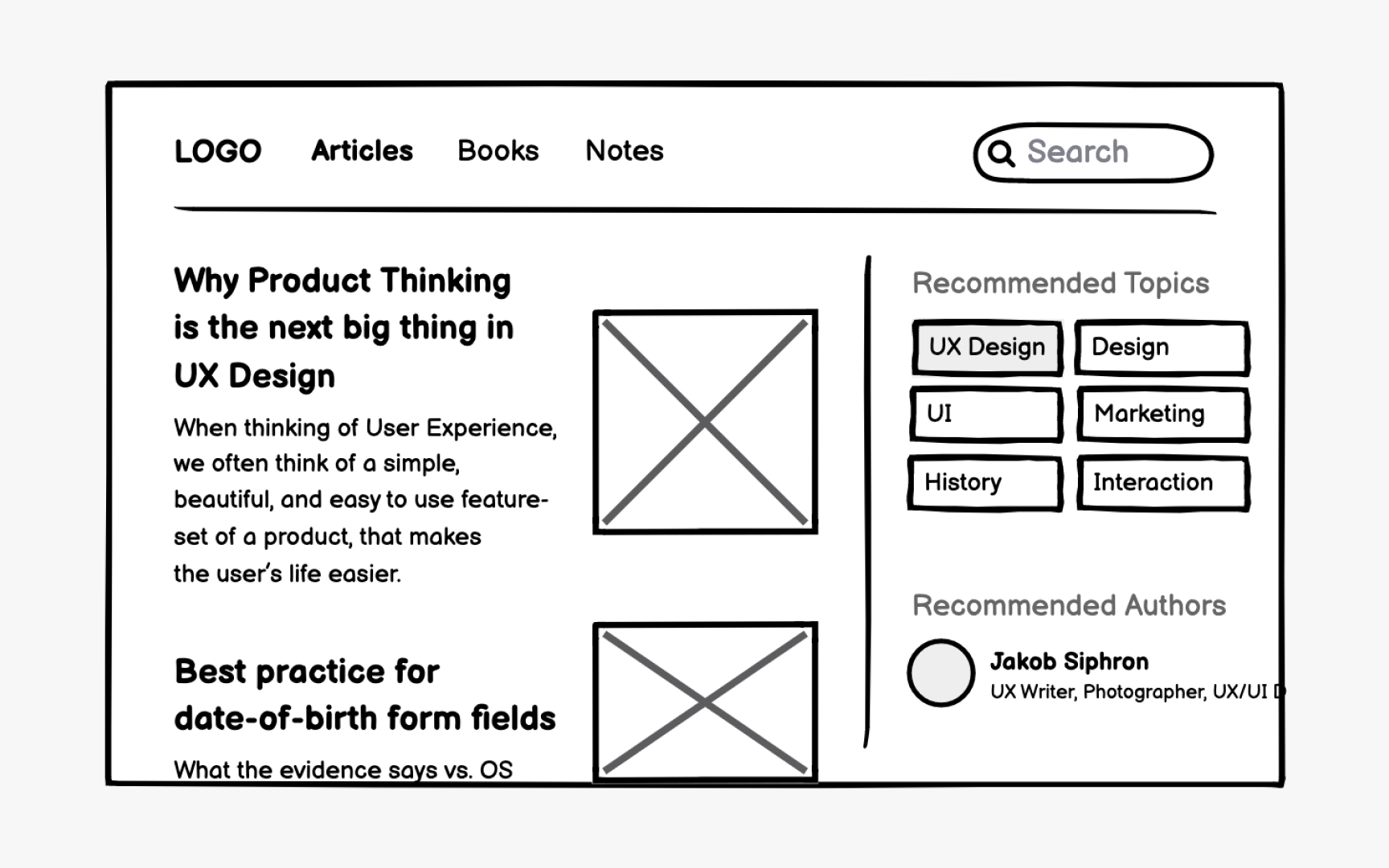
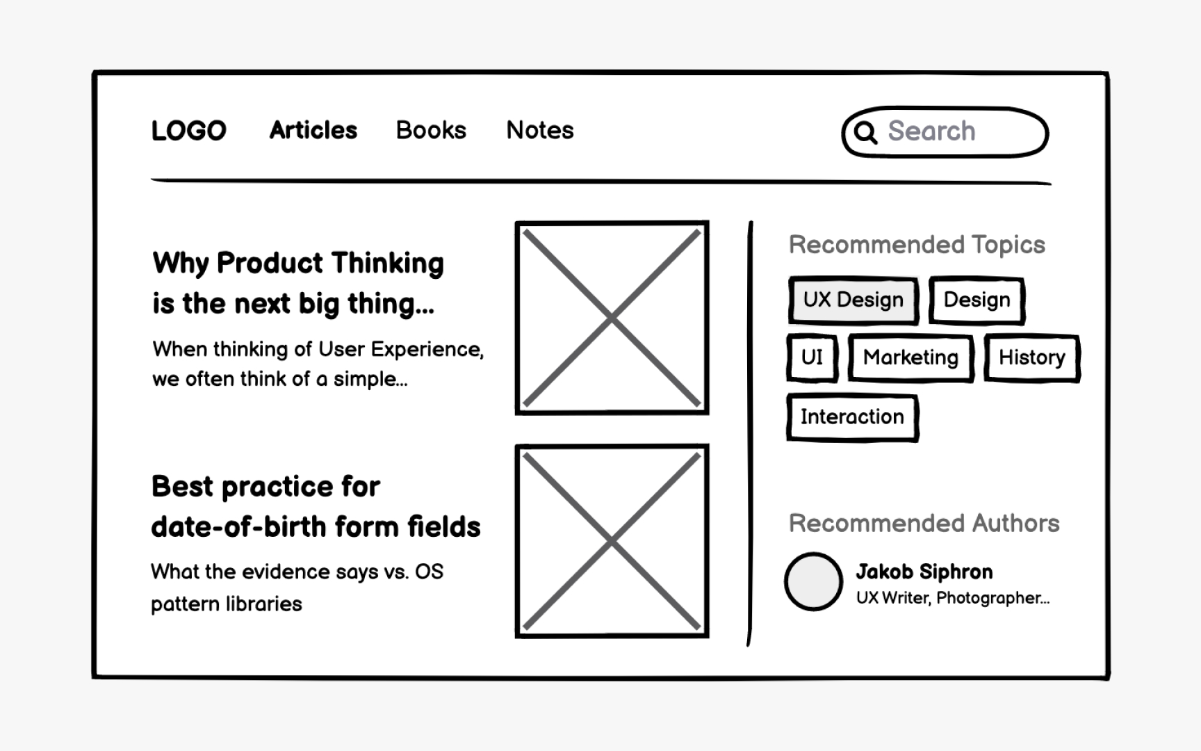
Headlines often use truncation with an ellipsis when space is constrained. Users should still access full titles through hover states or tooltips. Include at least a few visible characters before truncation begins, giving users enough context to understand the content.
Text blocks in constrained spaces benefit from "Show more" patterns that indicate additional content exists below the fold or on another page. This maintains clean layouts while preserving access to full information.[1] Documenting these wrapping rules in wireframes ensures consistent implementation across the product.
Pro Tip: Apply truncation patterns consistently to breadcrumbs, pagination, and long URLs throughout the product.
References
Top contributors