Checking color accessibility
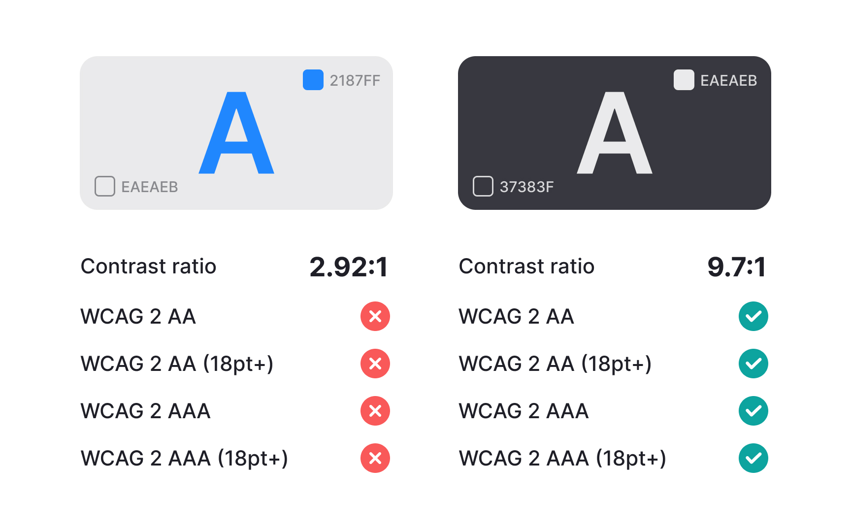
After defining your palette, every color pair used for text, icons, and surfaces should be checked for contrast. Contrast testing ensures readability and meets accessibility standards. You can check contrast using tools like WebAIM Contrast Checker, Figma’s built-in contrast checker, or browser extensions that test color pairs directly. These tools confirm whether the combination meets recommended contrast ratios for normal and large text.
To make future work easier, create a small list of approved color pairs that always pass accessibility checks. Store this list in your design system documentation so designers do not need to test the same combinations repeatedly. When new colors are added to the palette later, test them against your main surface and text colors and add any passing pairs to the same reference. This keeps the accessibility workflow simple even as the palette grows.[1]
