Component-level accessibility expectations
Every component in a design system needs to meet clear accessibility expectations before teams can rely on it across products. These expectations include readable contrast, clear labels, visible focus states, correct semantic structure, and smooth keyboard navigation. When any of these pieces are missing, users may struggle even if the component looks visually correct. A styled button, for instance, becomes unusable if focus is not visible or if the label cannot be announced by a screen reader.
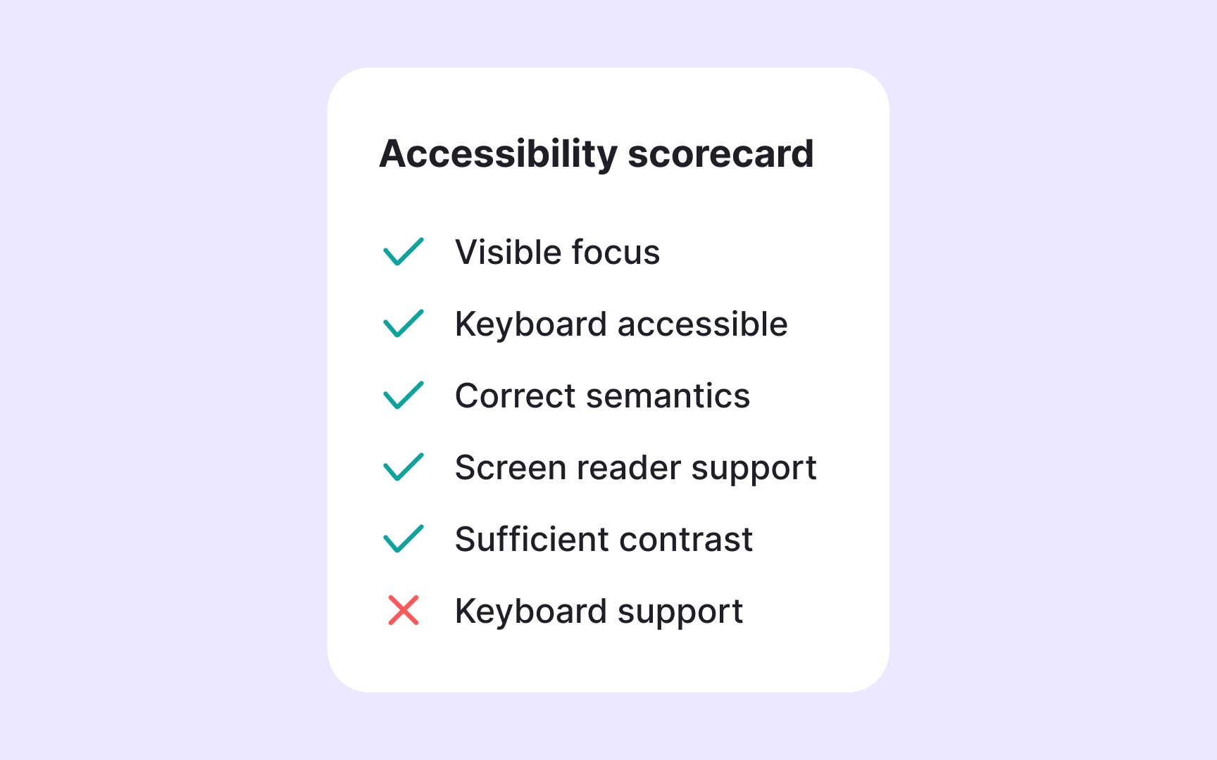
Some design systems use accessibility scorecards to keep these checks consistent. A scorecard is a simple visual panel attached to a component’s documentation. It shows whether the component is visually accessible, compatible with screen readers, fully navigable, and predictable in behavior. Each category is evaluated by the design system team, usually designers and accessibility specialists. Their goal is to confirm that the component meets WCAG-based criteria and common usability needs. The scorecard works like a quick status indicator that tells teams if a component is ready to use or still needs updates. It also helps designers understand what to check when creating new components.
