Annotations and documentation that guide teams
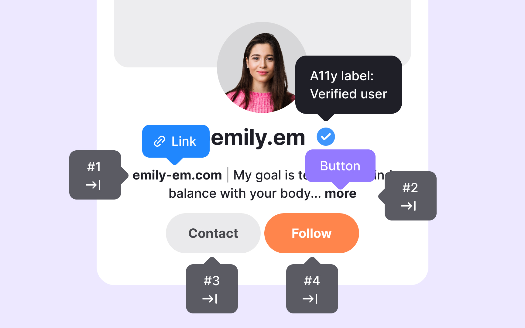
Annotations allow designers to bring accessibility decisions directly into their layouts instead of leaving them unclear or scattered across separate notes. These small markers can point out where alt text is needed, how elements should be grouped semantically, or which parts of a component should receive keyboard focus. When annotations sit inside the actual file, they show the designer’s intent in context. Engineers can see what needs attention at a glance rather than guessing or searching through comments.
To make this process smoother, teams often store annotation assets in shared Figma libraries. This lets designers drag and drop ready-made notes into their files using a consistent format. A shared library also helps new team members quickly understand how accessibility expectations are communicated. Many design systems include these assets in their handoff kits along with examples that show how to annotate components, screens, or specific interaction patterns. These examples teach designers how to apply semantic structure, identify alt text needs, and highlight expected behavior without overwhelming them with rules.
Documentation explains the principles behind the annotations, while the annotations show how to apply those principles in a real layout.
Pro Tip: Add annotations during design, not at the end, so accessibility decisions stay clear and consistent.
