Elevation
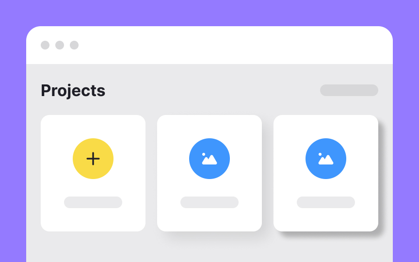
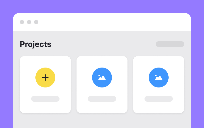
Elevation creates hierarchy in digital interfaces. It shows which elements sit above others in the visual stack, helping users understand relationships between different parts of the screen. Modern interfaces use multiple elevation levels, with higher elements appearing to float further from the background. Designers achieve elevation through shadows, subtle color shifts, and layering techniques. This vertical spacing guides users through the interface naturally.
Elevation also improves usability. Elements at higher elevations naturally draw attention, making interactive components easier to identify. When a button sits at a higher elevation than surrounding content, users immediately recognize it as clickable. This visual system speeds up navigation and reduces the mental effort needed to understand the interface. By assigning consistent elevation values to similar elements, designers create predictable patterns that users learn quickly.
Pro Tip: When overused or used improperly, elevation can add visual confusion to a design and hurt its usability.


