Asymmetrical composition

Asymmetrical compositions are well-suited for more complex and exciting designs with several focal points. They’re also more difficult to do well than symmetrical compositions since there’s no mathematical formula for creating them — they rely on a designer’s eye instead.
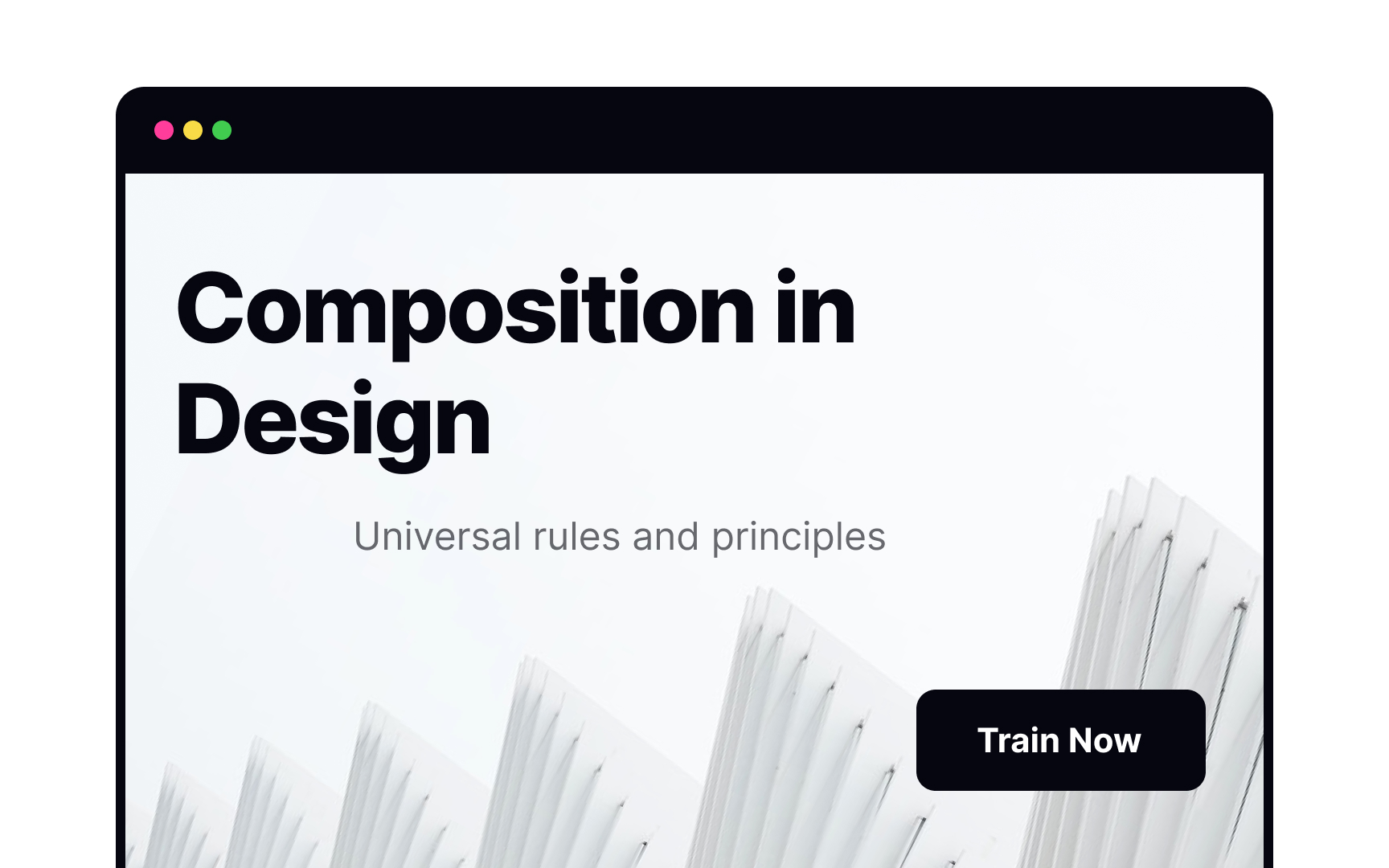
In this example, the headline on the left is the main focal point for the design, while less significant focal points — the subhead and CTA button — are on the right. Achieving an asymmetrical composition like this that’s still aesthetically pleasing and balanced requires more practice.
