Subtlety
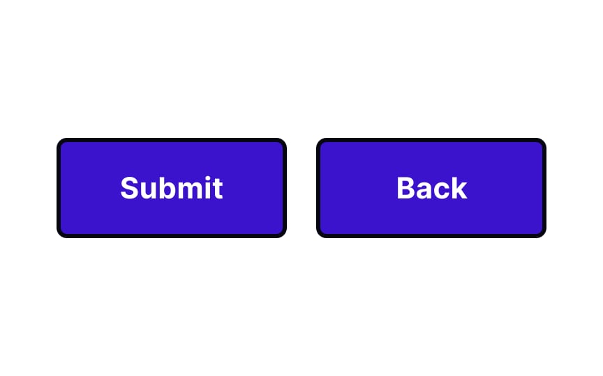
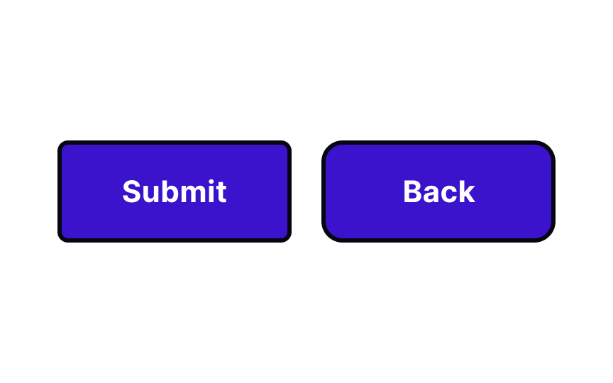
Using a subtle contrast can make a big impact on user perceptions. For example, buttons with slightly different corner radii stand out from one another. A button with a smaller corner radius looks more conventional, while one with a larger radius seems friendlier, encouraging users to interact with it.
Be careful with subtlety, though. Too little contrast can actually feel like a mistake to users and make a composition appear unbalanced.


