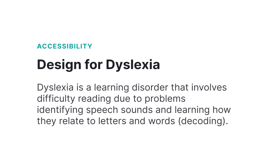
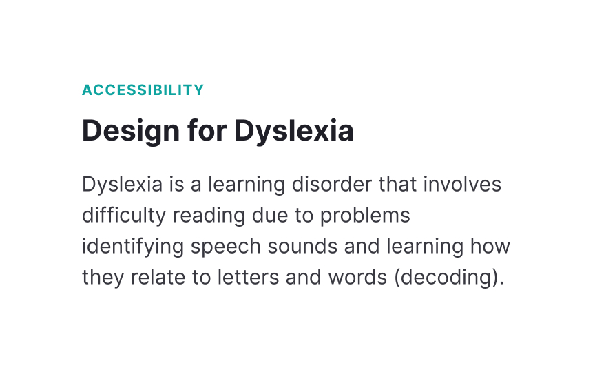
Add enough line height
Proper line spacing helps readers track from one line to another. When lines sit too close together, words can appear to merge across lines. This makes reading more difficult, especially for people with dyslexia who may struggle to follow text.
For body text on the web, set line height between 1.5 and 2 times the font size. This spacing creates clear visual separation between lines without making them feel disconnected. Headers typically need less line height (1.2 to 1.3) since they're often single lines of larger text.
Also keep in mind that different typefaces need different line heights. Typefaces with large x-heights may need more spacing, while those with smaller x-heights might work well with less. Always test your line height with your chosen typeface to ensure optimal readability.


