Follow font size recommendations
Font size directly impacts text legibility for all users who rely on vision. Selecting appropriate sizes ensures your content remains accessible across different age groups and visual abilities.
Our vision naturally changes as we age, making text readability increasingly important. Research shows that by age 60, only about one-third of the light reaches the retina compared to age 20.[1]This physical change makes smaller text significantly harder to read for older adults, who form a growing segment of digital users.
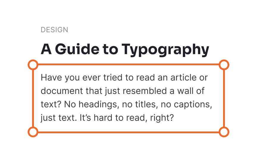
To accommodate these natural vision changes, use font sizes that work for everyone. While specific recommendations may vary slightly depending on the typeface chosen, 16px is generally considered the minimum acceptable size for body text.[2]Headings and other important elements should be proportionally larger to establish a clear visual hierarchy and improve overall readability.


