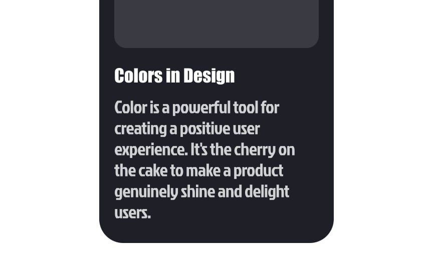
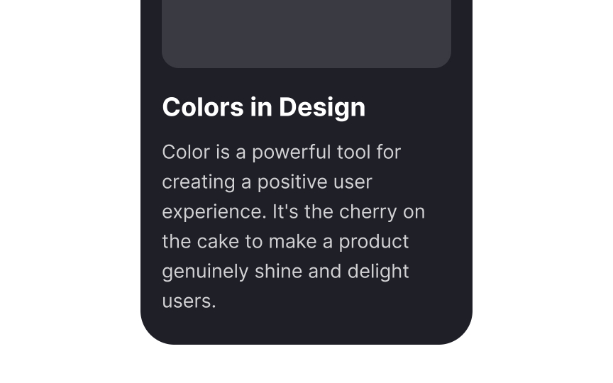
Choose legible typeface
When designing for everyone, it's important to make sure that your text looks clear and legible. Choose typefaces that:
- Look good regardless of the font size
- Have a large x-height — the size of flat lowercase letters — as they are comfortable to read even at a smaller font size
- Have consistent letter shapes but clear distinctions between similar letterforms like 0 and O or 1, I (i), and l (L)
- Support all of the characters and font styles that you need
Refer to the U.S. Web Design System for open-source typeface recommendations that emphasize legibility.


