Ensure that labels are visible
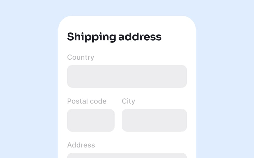
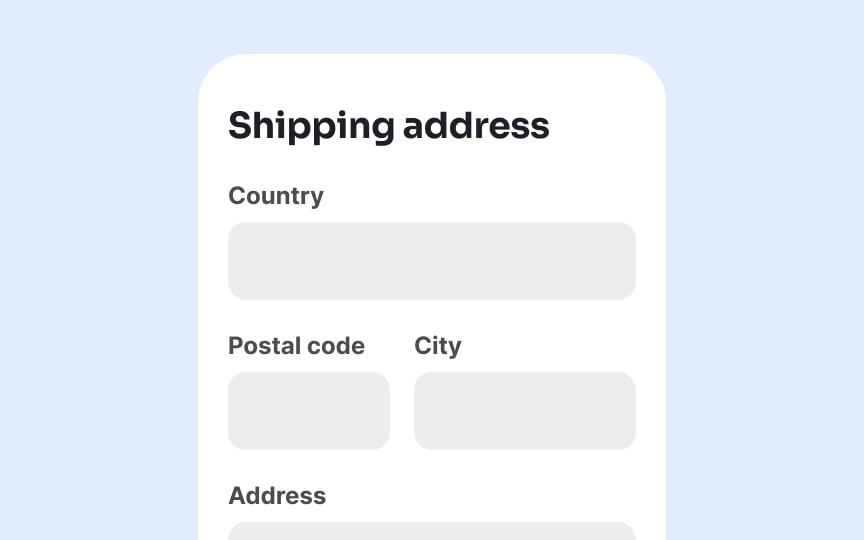
When labels are too small or lack sufficient contrast, users struggle to understand what information they need to provide. Make all form labels legible by using a minimum font size of 16px. This size ensures readability across devices and for users with various visual abilities. Anything smaller creates unnecessary strain, particularly on mobile devices where zooming disrupts the form layout.
Maintain a contrast ratio of at least 4.5:1 between label text and background colors. This ratio represents the minimum accessibility standard for normal text and ensures that people with moderate visual impairments can distinguish the text. Higher contrast (7:1) provides even better accessibility for users with more significant vision challenges.


