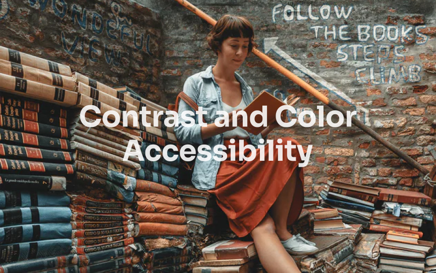
Be mindful of text overlaying images
Text overlaying images creates visual interest but often compromises legibility. This design approach can particularly challenge users with cognitive disabilities like autism, who may become distracted or anxious when trying to process text against complex backgrounds.
When text must appear over images, maintaining a minimum contrast ratio of 4.5:1 between the text and background is essential. The most effective solution is adding a semi-transparent overlay between the text and image. This technique preserves the image's visibility while creating sufficient contrast for the text.
The darkness and opacity of the overlay should be adjusted based on the image's content and colors. Darker images typically require lighter overlays with lower opacity, while brighter images need darker overlays with higher opacity. Test different combinations to find the optimal balance between aesthetics and readability.


