WCAG color contrast for text
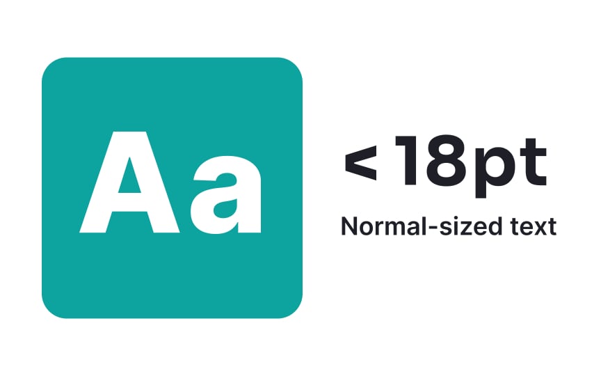
WCAG AA standards require a minimum contrast ratio of 4.5:1 for normal text (smaller than 18pt or 14pt bold). Large text with at least 18pt or 14pt bold requires a lower minimum ratio of 3:1, as bigger characters are inherently more readable at lower contrast levels.[1]
These contrast requirements apply to all text elements throughout an interface, including buttons, form fields, cards, notifications, and navigation menus. WCAG AA compliance is not merely a recommendation but a legal requirement for many governmental websites, public service platforms, and organizations subject to accessibility regulations.
Pro Tip: Use tools like WebAIM's Contrast Checker to verify your color combinations.


