Use enough white space to simplify content scanning
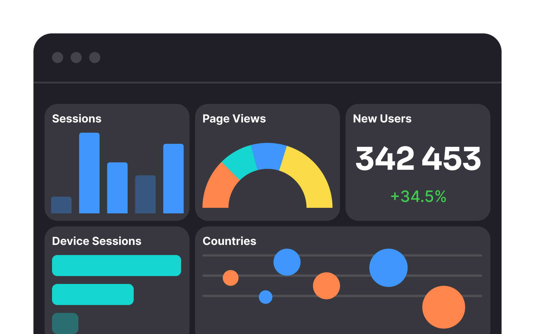
The human brain has limitations when it comes to processing large amounts of information simultaneously. While this might seem counterintuitive for data-rich dashboards, there's a solution. The strategic use of white space can effectively segment related content, improving its overall legibility. Moreover, it serves to highlight crucial elements, providing them with breathing space for better comprehension.
Ensure that there's ample space between different data points, graphs, and textual elements. This not only prevents visual overload but also directs the user's attention to the most critical information.
Top contributors

