Select the right chart type
Charts are powerful tools for illustrating complex data effectively. However, choosing the right chart type is crucial, as it depends on the specific goals and needs of users.
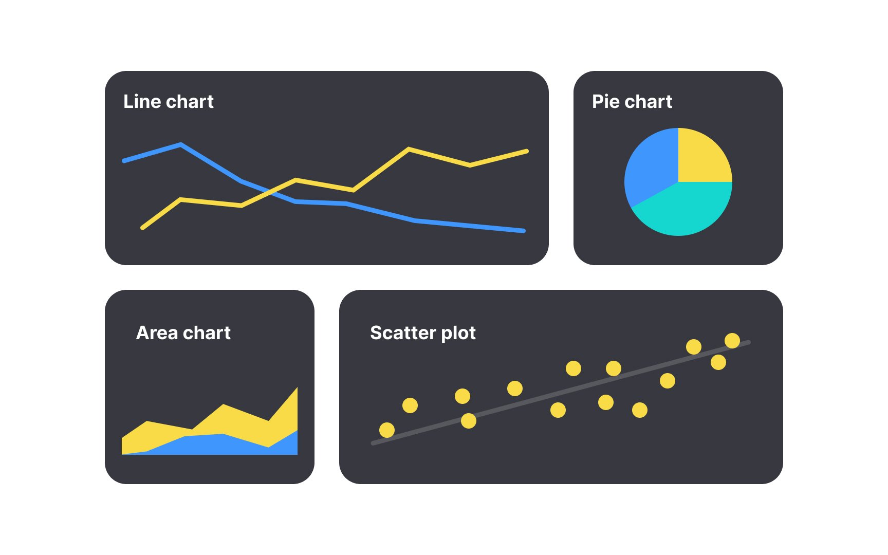
Consider why users need graphs:
- Use line charts or bar charts to track changes and trends over a period.
- Opt for scatter plots when analyzing correlations or associations between different data sets.
- Use area charts to show overall trends over time, especially when visualizing cumulative values.
- Utilize pie charts or stacked bar/area charts to represent components in relation to the whole.
According to Nielsen Norman Group, bar charts, line charts, and scatter plots are the easiest to understand.[1] Selecting the wrong chart type can overload cognitive processing and hinder data comprehension. This may lead users to abandon the product if they struggle to interpret the charts efficiently.
Pro Tip: Using patterns and textures in charts helps people who cannot rely on color, including those with color blindness or low vision.
References
- Choosing Chart Types: Consider Context | Nielsen Norman Group