Allow users to compare content groups
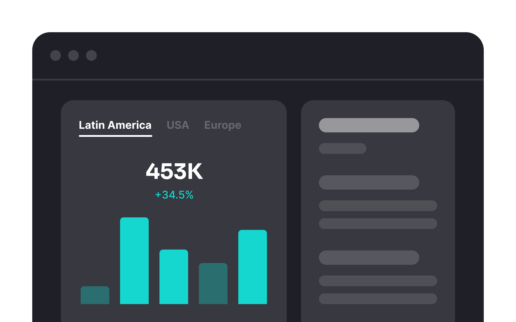
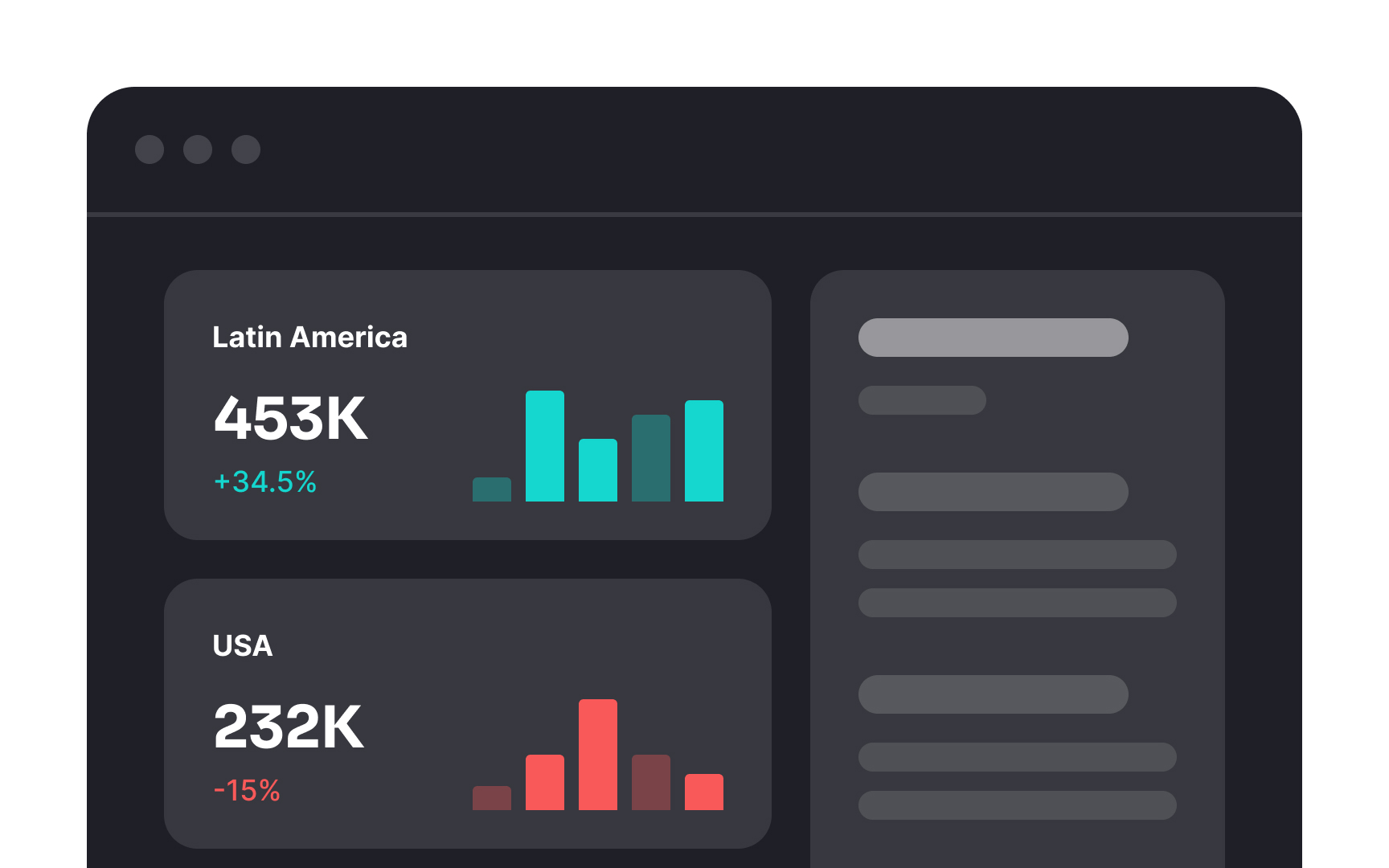
When you have lots of information to show on one dashboard, interactive tools like tabs or pop-up boxes are really helpful. However, there's a catch. Don't use these for groups of content that users need to compare at the same time. And never hide information that should always be visible.
For example, if you're showing sales data for different regions, it's better to display it all at once instead of making users click on tabs to see each region separately. This way, they can easily compare the numbers. And remember, always keep important information visible without needing to click or hover.
Top contributors