Avoid visual clutter
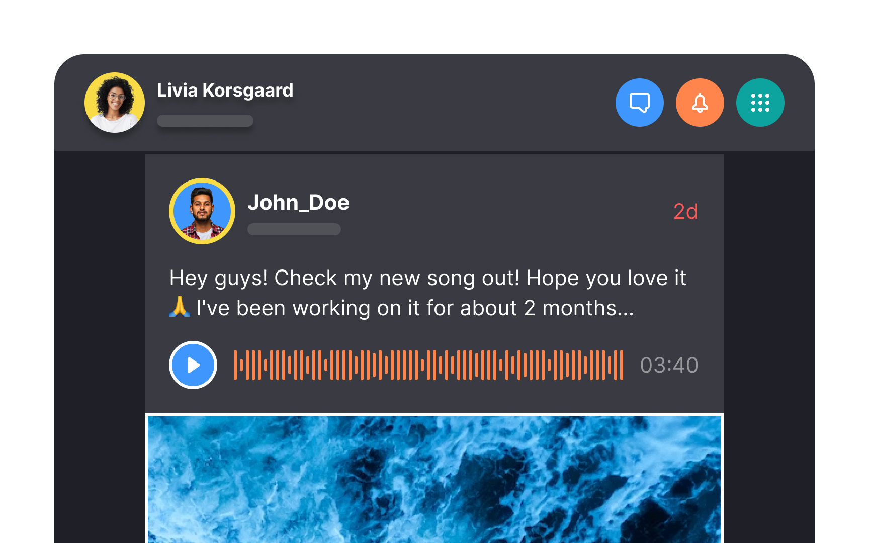
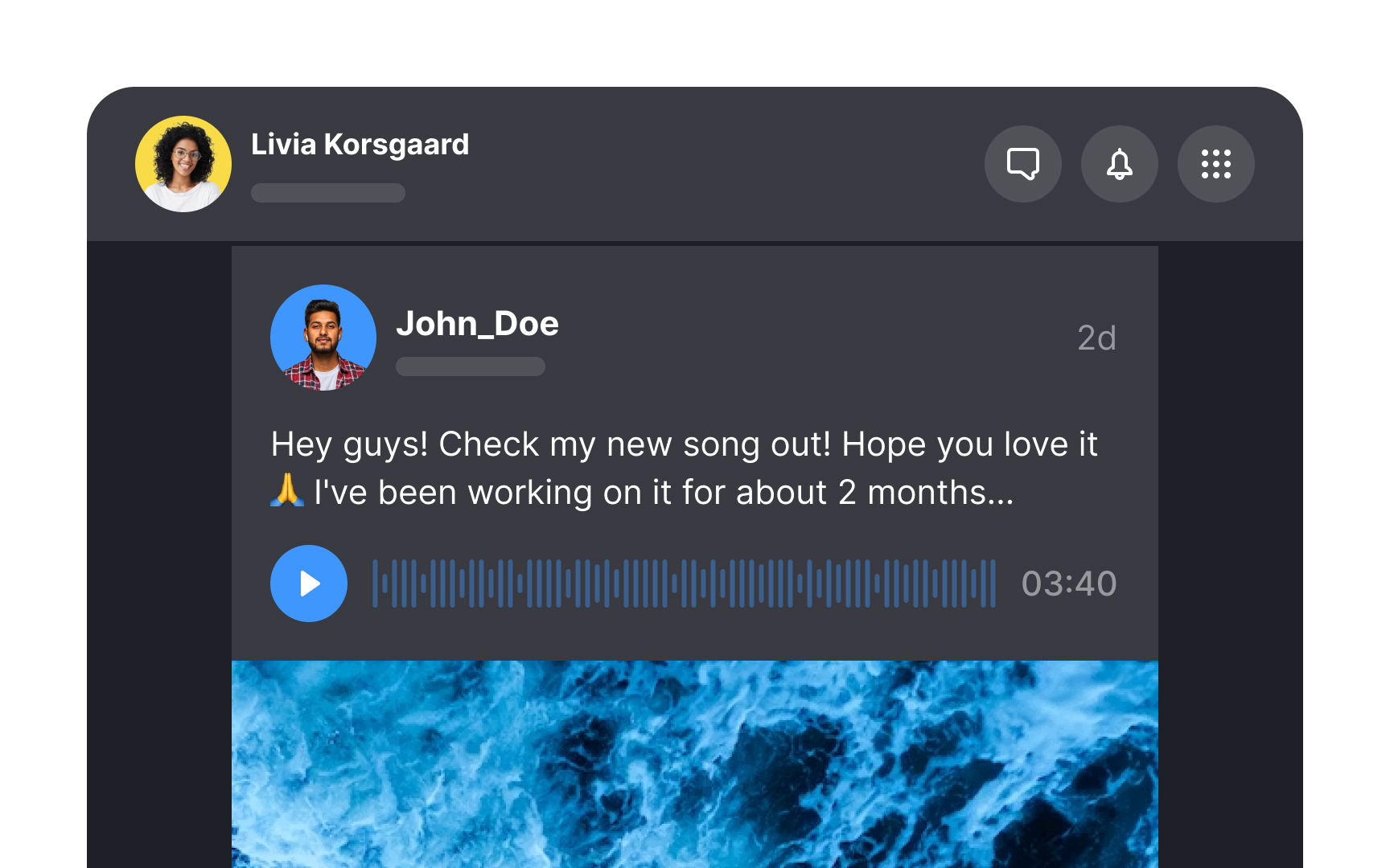
In feed design, opt for minimalism and clarity to steer clear of visual chaos. Users need to swiftly navigate through content, and a simple user interface facilitates this. Overcrowding with too many components, using mismatched fonts, or employing verbose labels can pull users' attention away from their main task.
With each feed entry potentially holding extensive custom data, it's your role as a designer to curate what's essential, presenting only what's needed for users to make informed decisions without the clutter.
Pro Tip: Simplicity isn't only about the visual appeal — it reduces the cognitive load on users.
